
Well, here they are, the final illustrations for Carbon City Zero. Celebrating cities and regions that are on board with the aims of the game – negotiating the complexities of cities and towns and, y’know – people, to achieve zero carbon emissions.

fig. 1: Cardiff
It’s been a mental tour of the country (and often a physical one too), trying to work out the logic and feel of places and spaces and twisting perception and geography around each other (and in the process re-living my experience of the film Inception).
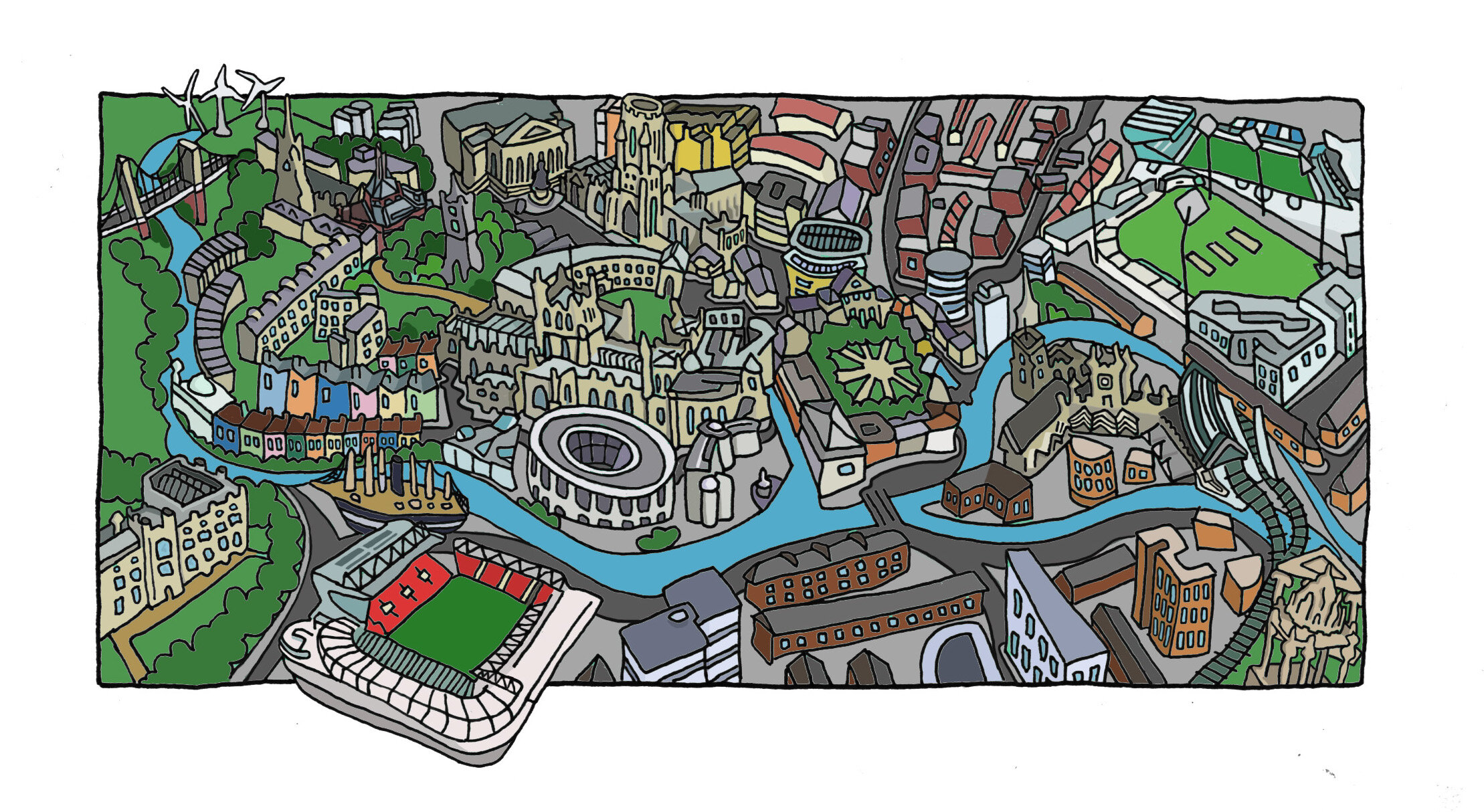
fig. 2: Bristol
With the pencils completed I moved on to the inking and colouring – trying to gauge distance and establish the relationships between buildings and areas. Playing with contrast and colour to imagine a world into being – or at least trying. (There’s a fair bit to be said about the God-complex that springs up around a project like this, though I’ve got to say for me there’s less maniacal laughter, and more eye-twitching and hair greying, and general anxiety about why the rules of space and time are a cruel joke played on me by the universe!)

fig. 3: Brighton

fig. 4: Machynlleth
I talked about the drafting of the compositions and the negotiation of the line in my post “Lost in space and time” and dwelt on the intellectual exercise of the pencils. Adding the colour was more about finding the feeling and atmosphere of a place – identifying the variations in tone and shade which breath life into what are stylised and symbolic representations of cities and regions across the country: Cardiff, Bristol, Brighton, Machynlleth, Edinburgh, Calderdale, Sheffield, Oldham, and where I started, Manchester [figs 1-9].

fig. 5: Edinburgh

fig. 6: Calderdale

fig. 7: Sheffield
Ironically adding colour digitally is a more reflective process than the expressive sweep of a brush, or mixing oils on the canvas. Nonetheless, expressing a sense of place is what colour and shade and tone and all that stuff, does, and it is what I’ve tried to do. The nine cities, towns and regions, are very different, and my initial worry about creating images that were too similar dissipated very quickly – even where I looked for ‘types’ of buildings to support unique features, something that became even more apparent as the colours were added. For each illustration I built up the colour palette from a colour chosen to represent my impression of the place – provoked by a building, the weather, or else instinct; and as a result, each image has its own integrity – even when architectural styles and materials might be similar.

fig. 8: Oldham
The twist and turns of pathways and highways, rail and water have wound their ways around my brain for weeks now, so to finish is both satisfying and a moment to pause, to reflect, but mostly, to sleep. Which is what I’m going to do now, in a bit… later anyway, after that thing I need to do, yeah, then.

fig. 9: Manchester