
There is a slow quiet in the air. Noises carry that bit further than before and paranoia lurks in the spaces you can’t quiet see. The blanket of quarantine is settling but has not yet fallen.

fig.1: Callander Place Names Map (extract)
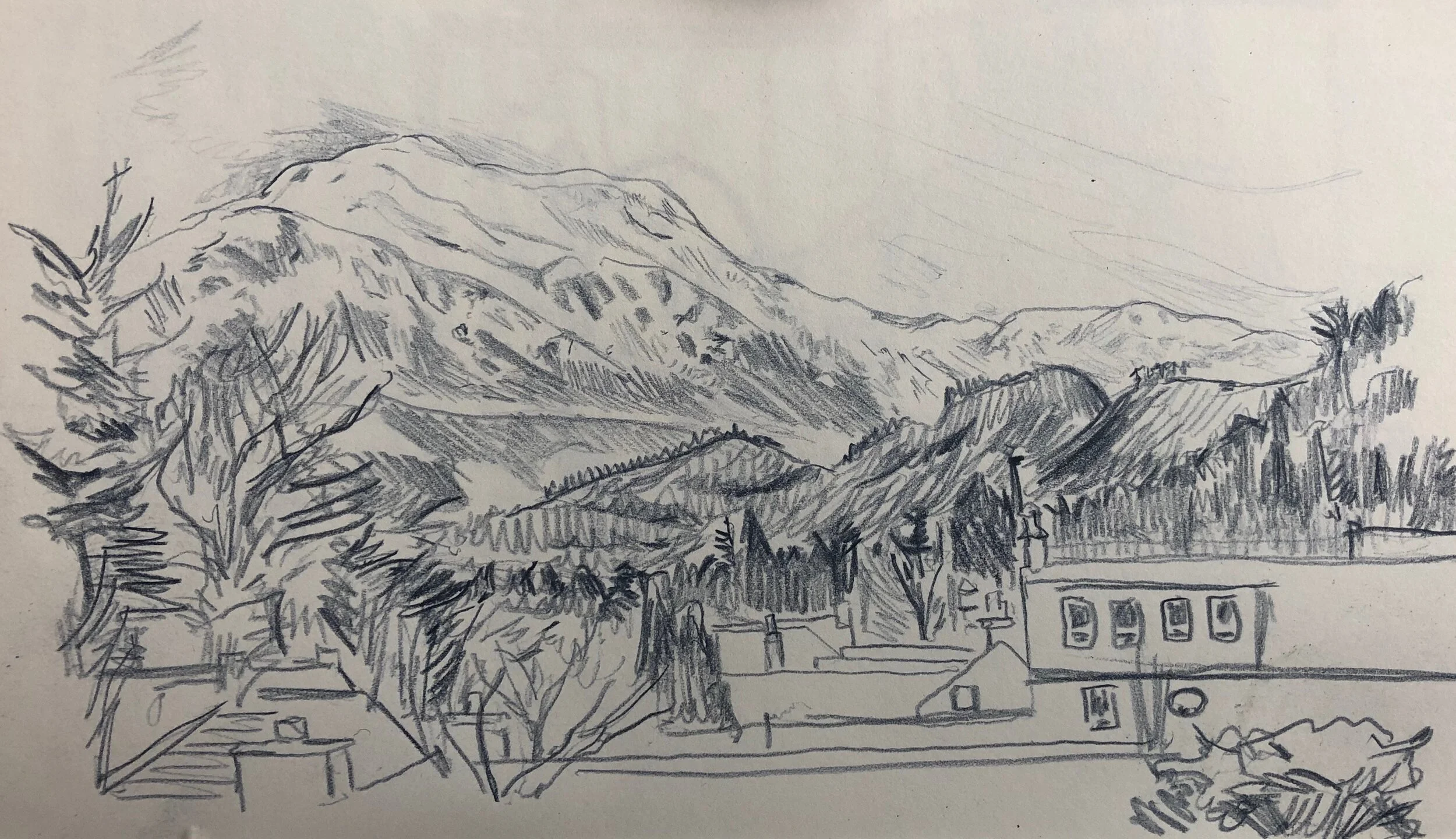
fig.2: Ben Ledi
I have finished the map [fig.1] – well nearly, which is why I missed last week, and I write this caught between my intent to recall my mornings of exploration in Callander, and the creeping realisation of what is to come. There may be a disconnect between these outside memories, and a more insular existence – at least for a while, but I hope that these reflections will at least free my imagination for a bit.
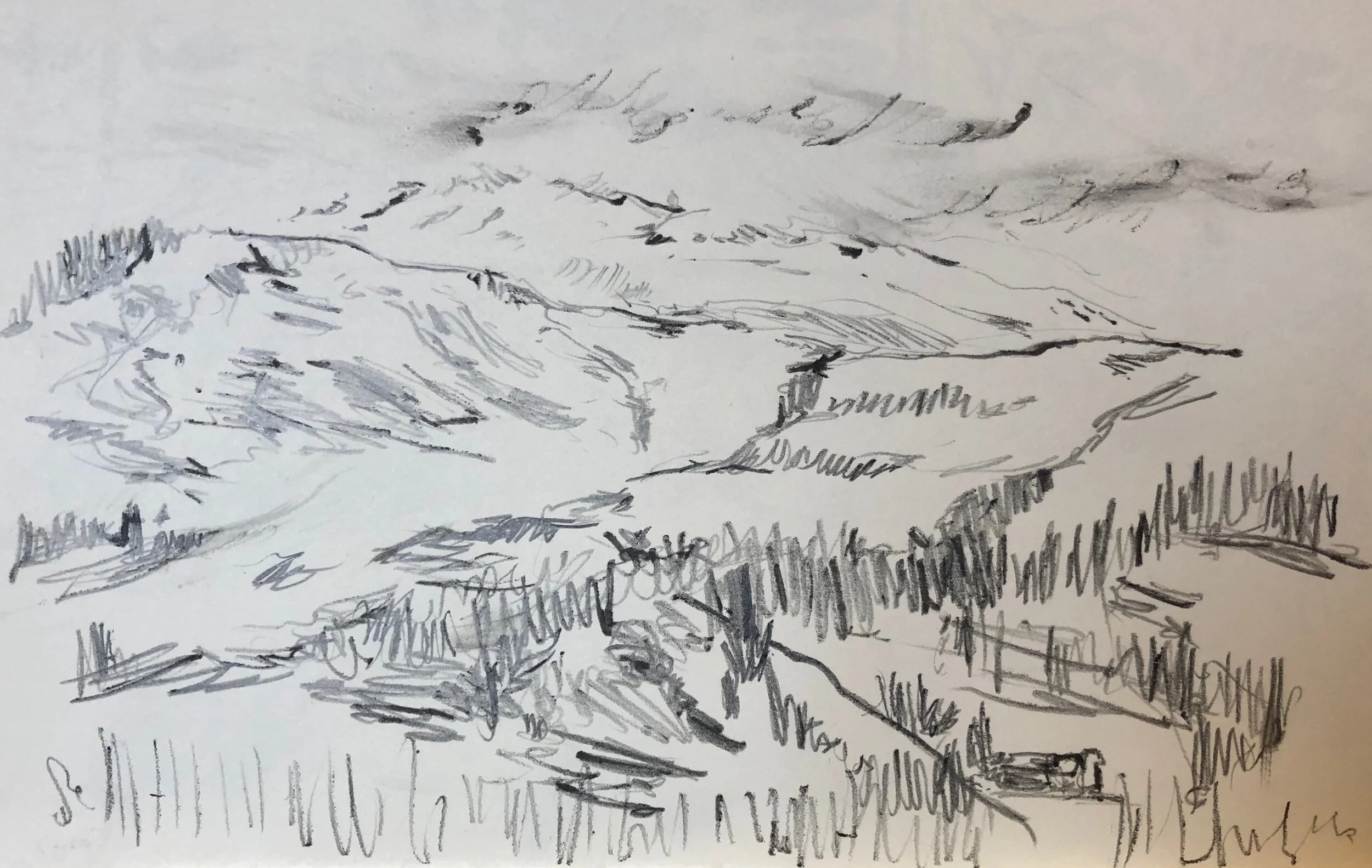
fig.3: Mountain view (after hypo)
These reflections begin and end with sketches of Ben Ledi – the mountain that rises above the far end of Callander, and the view from my B&B window, and its constant dialogue with the weather and surroundings. I had intended to leave immediately after breakfast, but I wanted to catch the mist, and the sense of something there, and not there [fig.2].
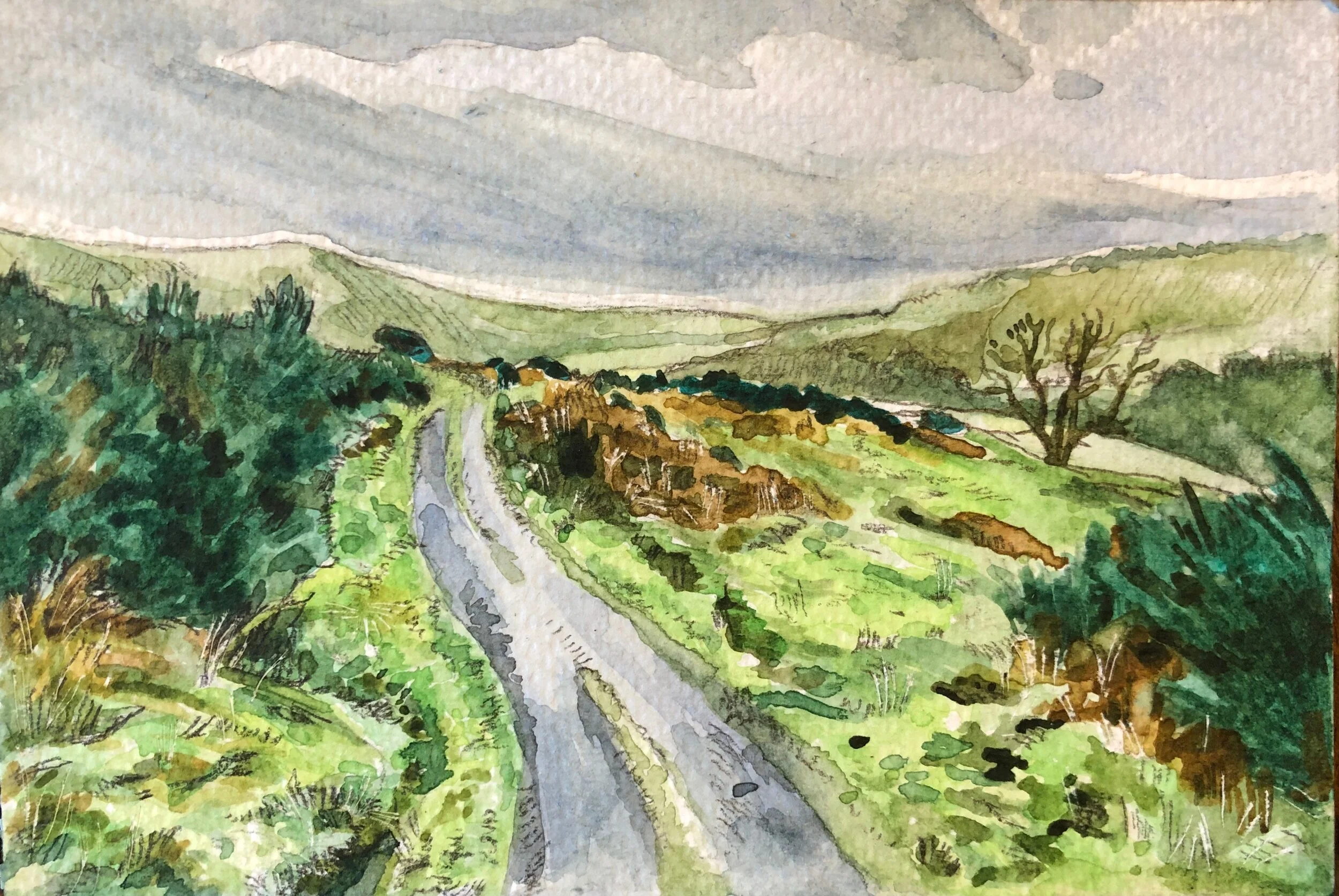
fig.5: View whilst walking
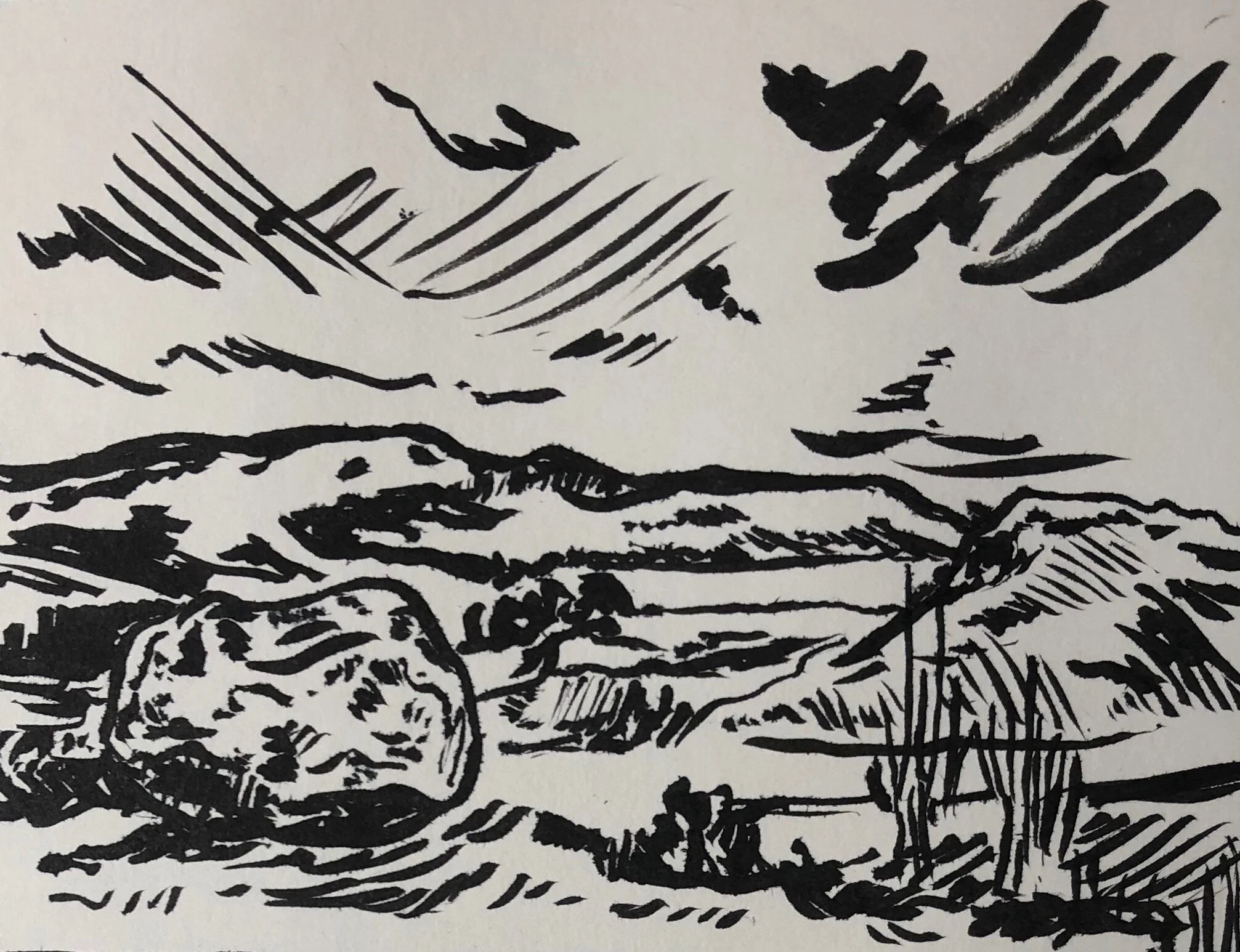
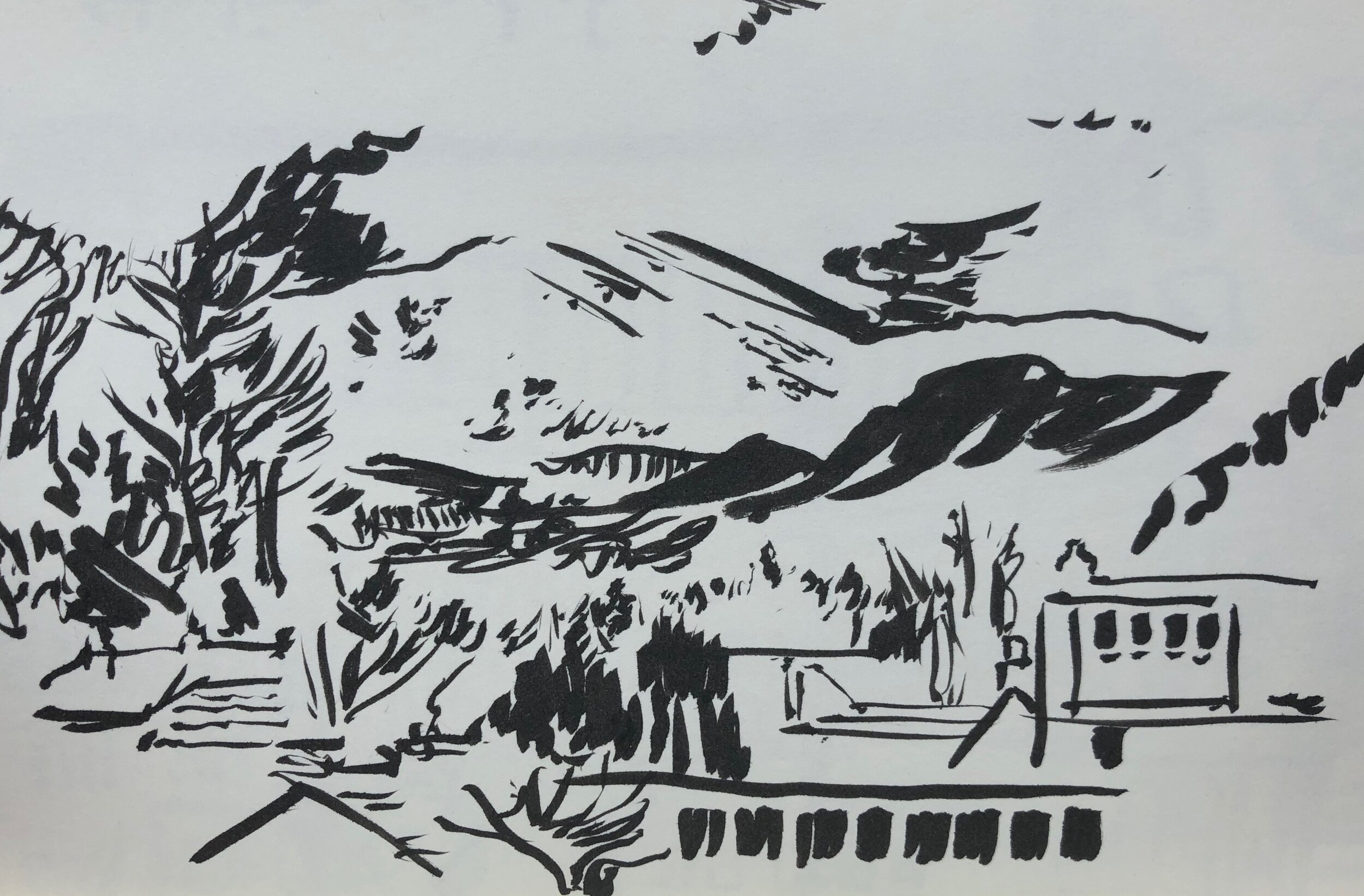
fig.4: Samson’s Stone View
I told myself I wanted to find a view over Loch Venachar. To be honest my plan for the day was just to walk and to notice. To find my way into the imagination of the landscape, to physically experience the distance and altitude. I wanted to be surprised, to be awed by views and the climate, and to be exhausted, challenged, and have to solve the problem of impromptu quagmires half-way up a slope. From a type 1 point of view I wanted to prove I could do this – that I had enough biscuits, sugar and testing strips to get through any hypos; that I would listen to my body and recognise any symptoms I might have, and if not, at least I might be aware enough to head them off at the pass. In the event of course I had a hypo, and I was able to recognise it, and to know it would be coming, but carbs are funny things – sometimes they work quick, but this time not quick enough, so I sugared up, sat, and looked [fig.3].
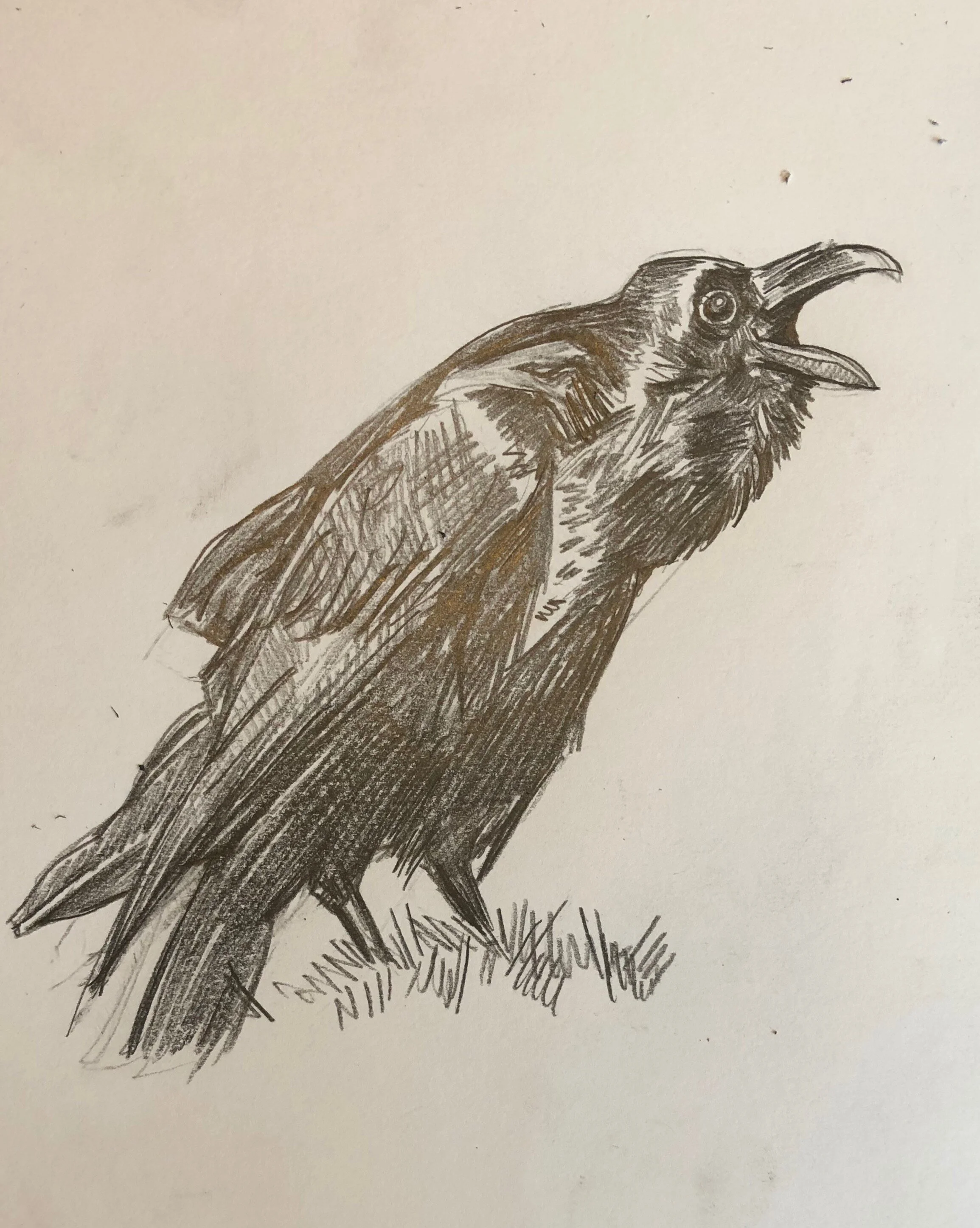
fig.6: Raven study
Walking brings you suddenly on the unexpected – a scene or composition that arrests; fleeting colours on the mountains; jostling tones of grasses, heathers and woodland; the noise of streams, the feel of the wind; and contours of the land that hint at secret pathways that lead to who knows where. A generally dry morning let me ramble, stopping to sketch or take photos on a whim, but mostly to follow the landscape up to and over the edge of sight. Looking back over the sketches and the watercolours I am struck by the sense of space, the sense of stretching out – which, I guess, is what mapping is all about [fig.4 & 5]. Landscapes tend to draw the eye in and through the details of the countryside until finally the eye is drawn upward into the sky’s expanse, where dreams dance.

fig.1: Callander Place Names Map (extract)
These studies, comments and reflections are experiments with line, tone and colour that inform a final piece that is necessarily more graphic; tracing a process that works through a dialogue between the wild mark making of my initial responses and the clarity of the final brief. Sketches in pencil and watercolours play with the tones and the delicacy of a landscape that is shifting and fluid, whilst the ink of the brush pen looks to follow contours and line, hopping over the rhythm of the edges. This essence is the catalyst that provokes further research into the narratives of folklore in the imagining of place of and space to inform the final illustrative design [fig.6 & 7].


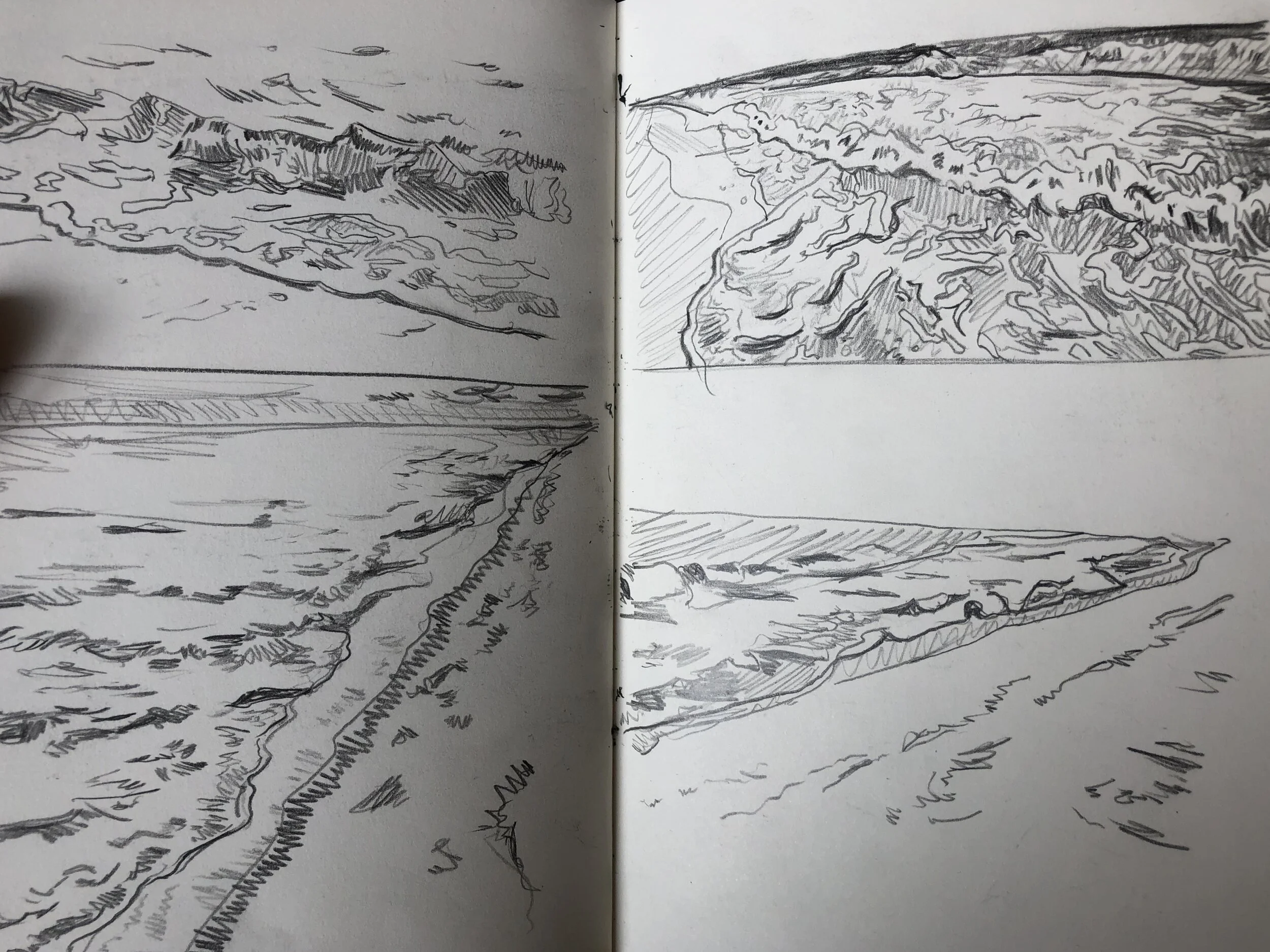


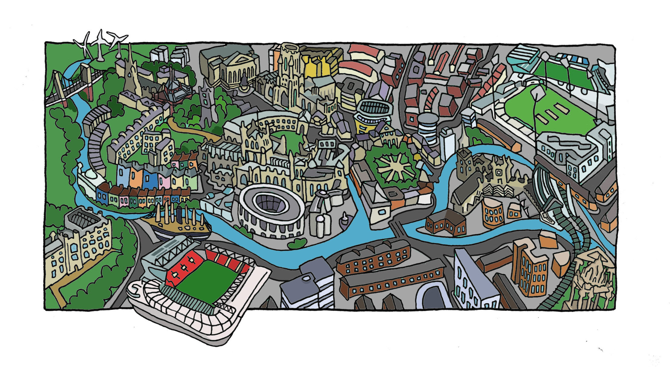


![fig 3: Manchester (pencil sketch) [this was the first image and the final versions are to be done with/without lettering, so for the rest I’ll do that on Photoshop]](https://images.squarespace-cdn.com/content/v1/521735b4e4b0563499dc8f68/1572264904458-826VYD67ESRK6VBLWHFL/manchester+pencils.jpg)
