
I found myself running headlong into Christmas, swapping the final deadlines of work for the final deadlines of the holidays: – shopping, cooking, family, mild disorientation, alcohol induced delirium, and stop.
Creatively, this just feels like burnout, as if the world around seems to fade into blobs and shapes that drift in and out of focus, losing definition and focus, and colour. In fairness, this may just be the influence of winter, revealed fully when the trappings of Christmas come down.
So, I took some time not to create, which was good – till it wasn’t. I began to try and provoke some form of creativity – to jolt myself into vague projects that hovered at the edge of my thoughts, or to manufacture a creative epiphany in some kind of Frankenstein inspired experiment. These attempts whimpered out - whether through weather, practicality, the lure of a lingering mince pie, or a power-cut.
Deciding that overthinking was the problem I decided on simplicity (partly through a visit to see Dad and connect through drawing animals that mean a lot to him), to take time to properly look. Being away from urban spaces, and having spent much of the last couple of months lost in them anyway, I went for watercolour sketches of nature – specifically animals and the countryside. As I was moving around, these sketches are all postcard size, and painted with a traveling watercolour palette [fig: 1-4].
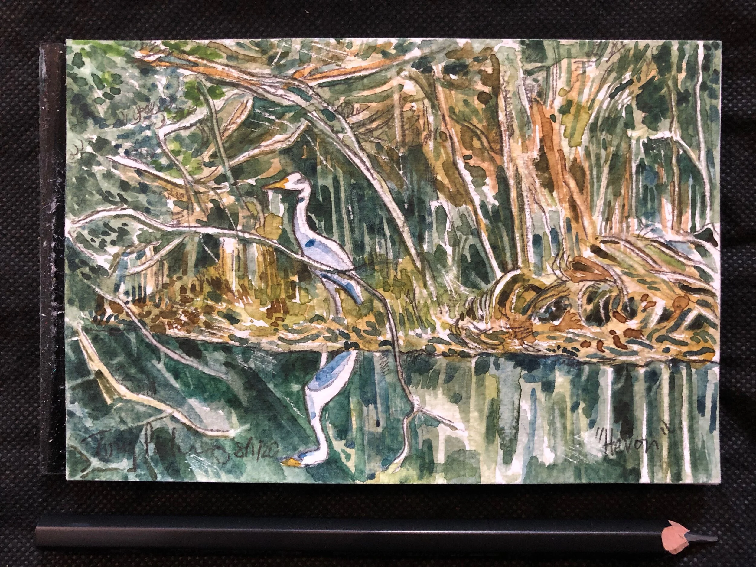
fig.1: “Heron”
The limited palette provided a discipline to the sketches – mixing colours that appear too much, then using water to dilute intensity, and develop a range of tone. The colour mix creates the language, whilst the dilution enables its expression.
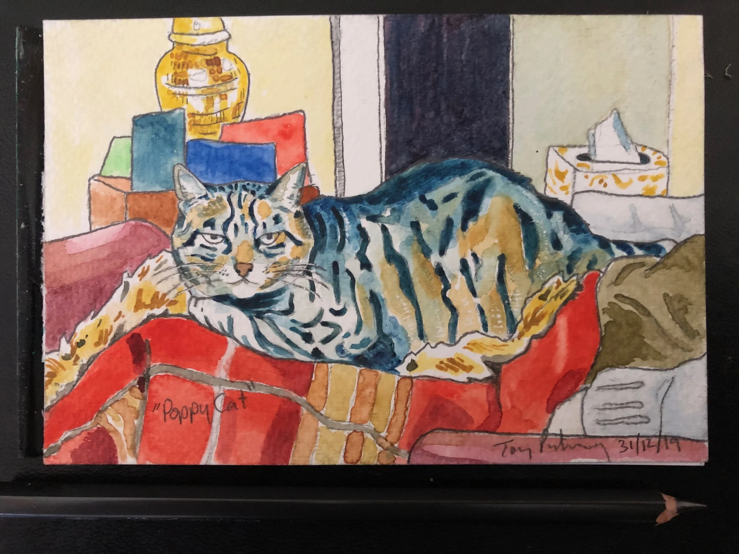
fig.2: “PoppyCat”
Unlike oil, where I like to get paint on the canvas quickly, or working digitally where you can block in a background to provide an anchor for the colour, watercolour demands that you stop and think, and work out the negative space and colour of the scene or subject. A slower start, which can be daunting, as you have time to consider how you might cock it up.
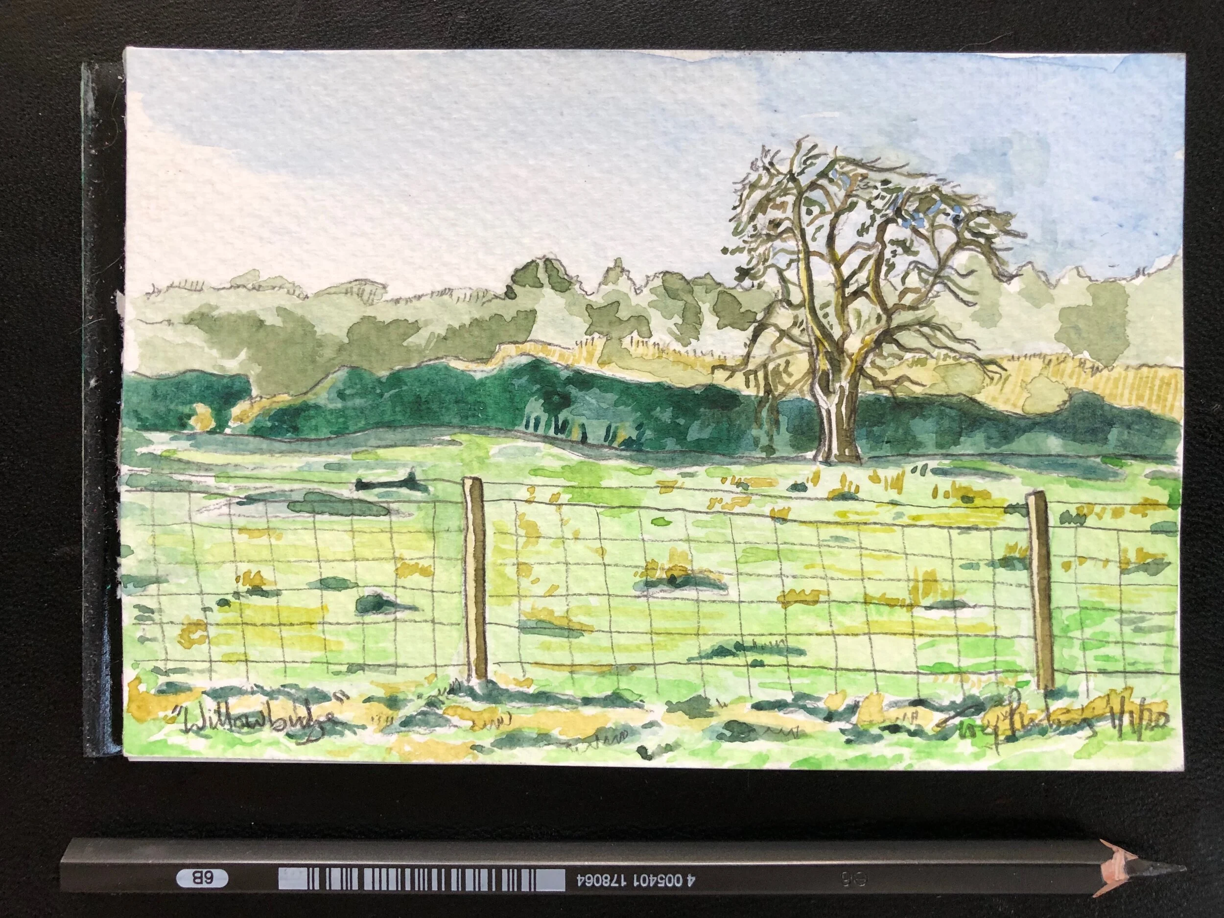
fig.3: “Willowbridge Field”
I like to begin in the shadows, to define the shape of the painting, but also these are areas where you are likely to rework, so mistakes will be subsumed in the process of creating the image. Beginning with shadows also allows me to identify what the base colour for the painting will be – whether the darkness is red, blue, green or brown. All my subsequent colour decisions will come in harmony or contrast from this start.
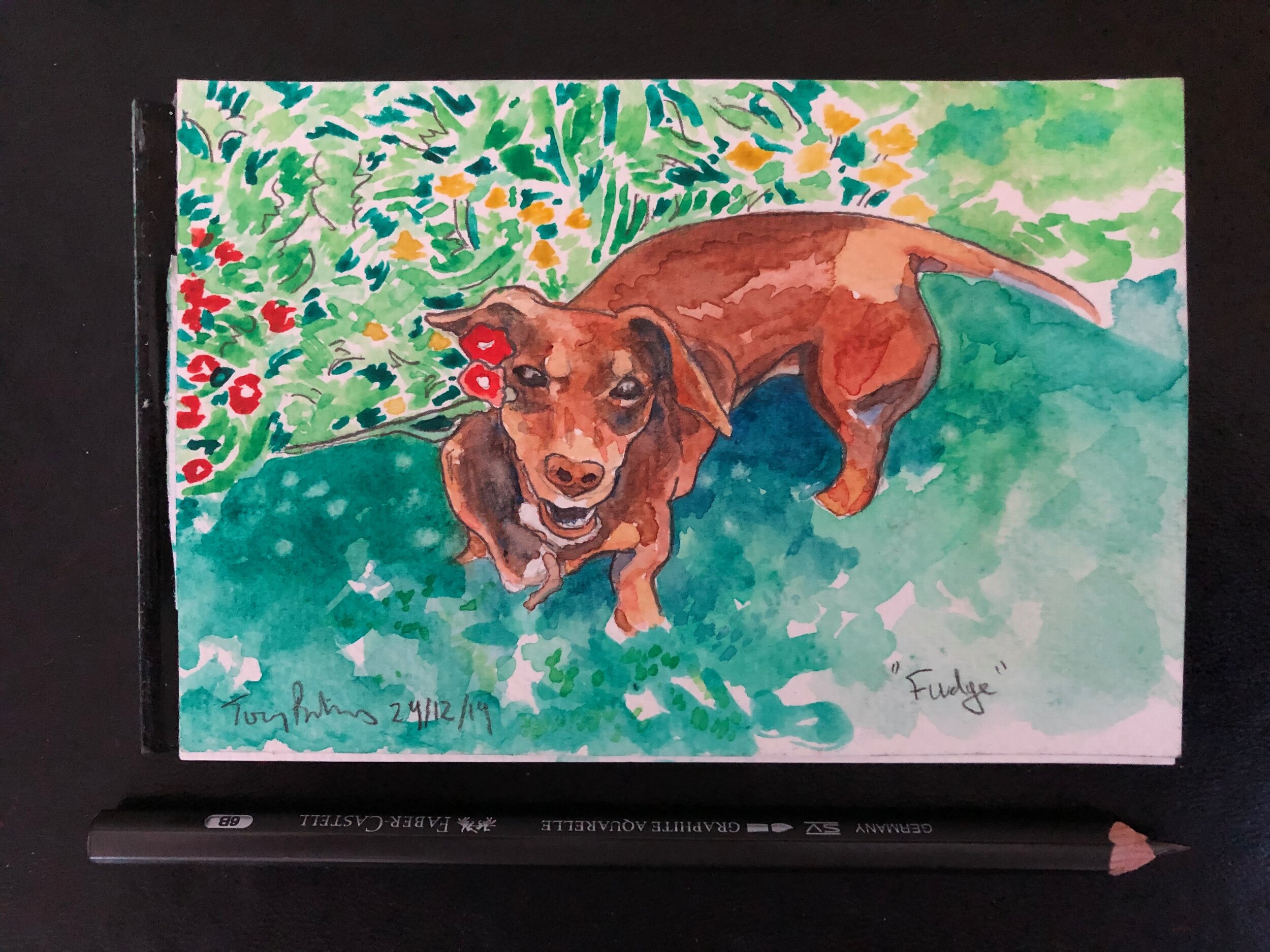
fig.4: “Fudge”
I like the results – they are more subtle than some of my graphic work, but also have a narrative quality – of anticipation, of disdain, of mystery, of hope, yet they also speak in my use of colour. Most importantly they have carried the boulder to the top of the mountain, and ideas are now rolling downward… I think that’s a good thing…