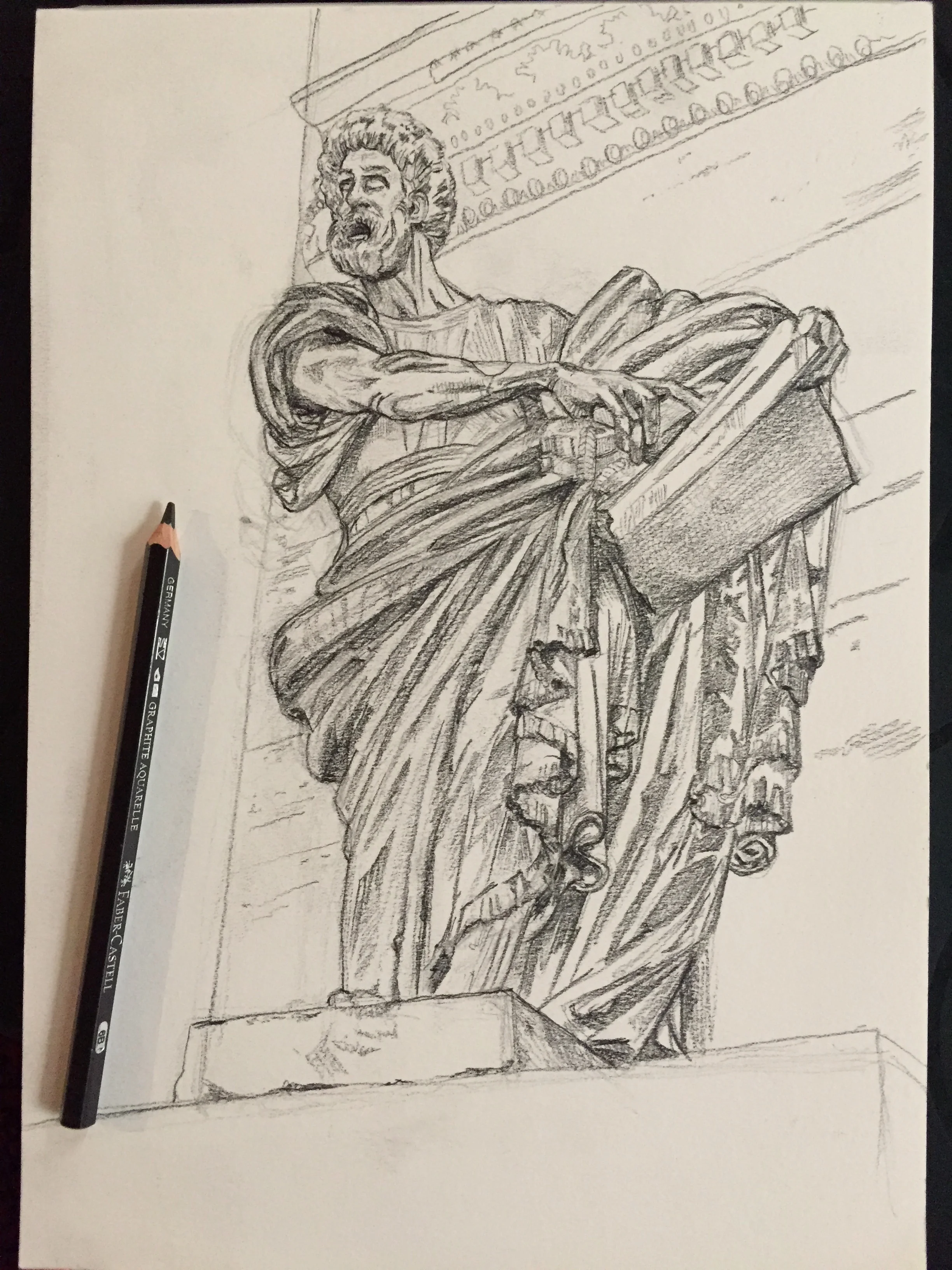
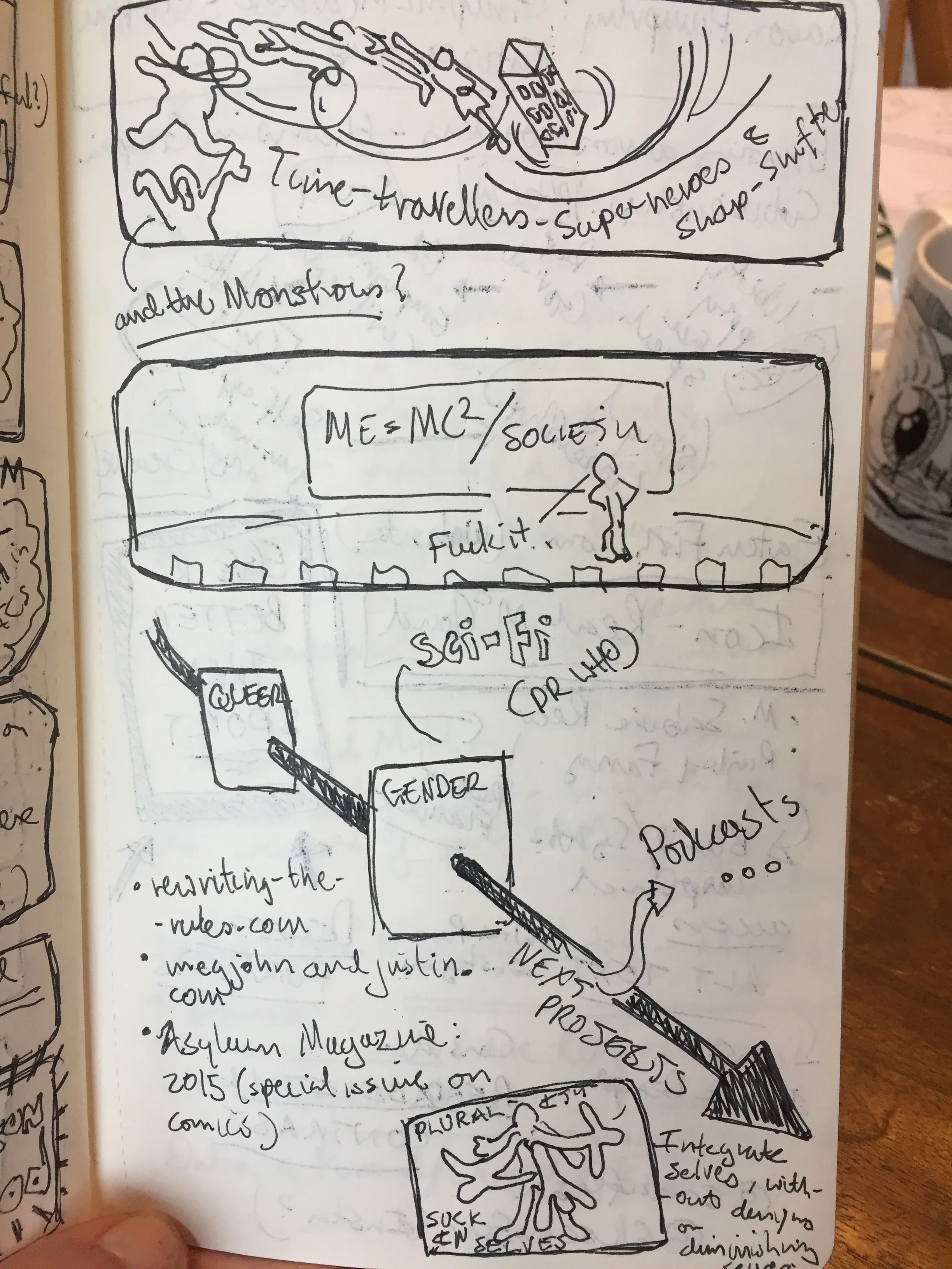
It’s raining. Again. Hello Autumn. The mornings are now dark, the weather less inviting and the heating is cranking up. Time to hunker down, and a time that is naturally more introspective. I’ve got a couple of technical projects on the go at the moment – lots of detail and tiny hand flicks, so I’m using the Instagram #Inktober prompts to keep my mind working in different directions, my hands relaxed and go off piste.
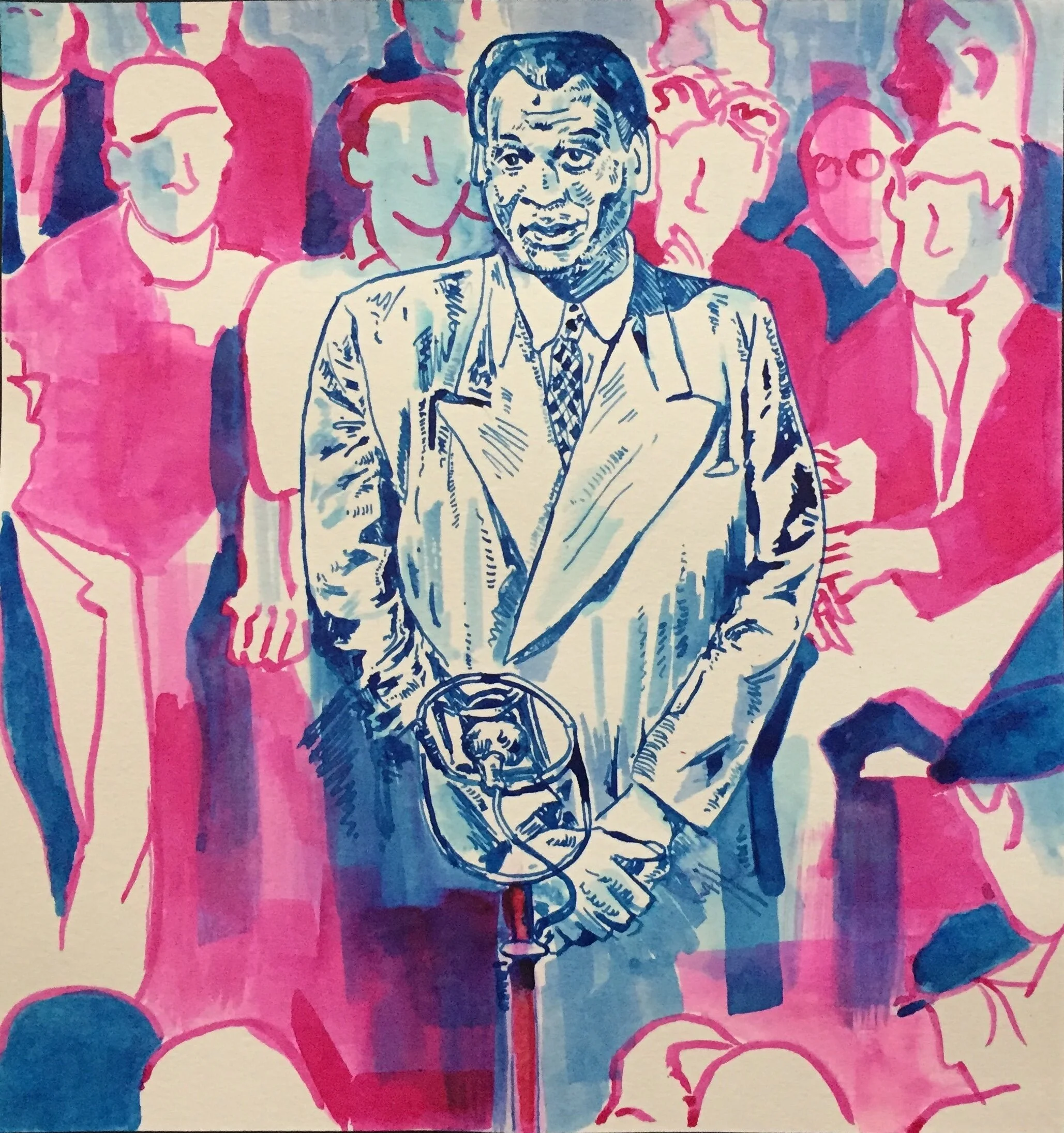
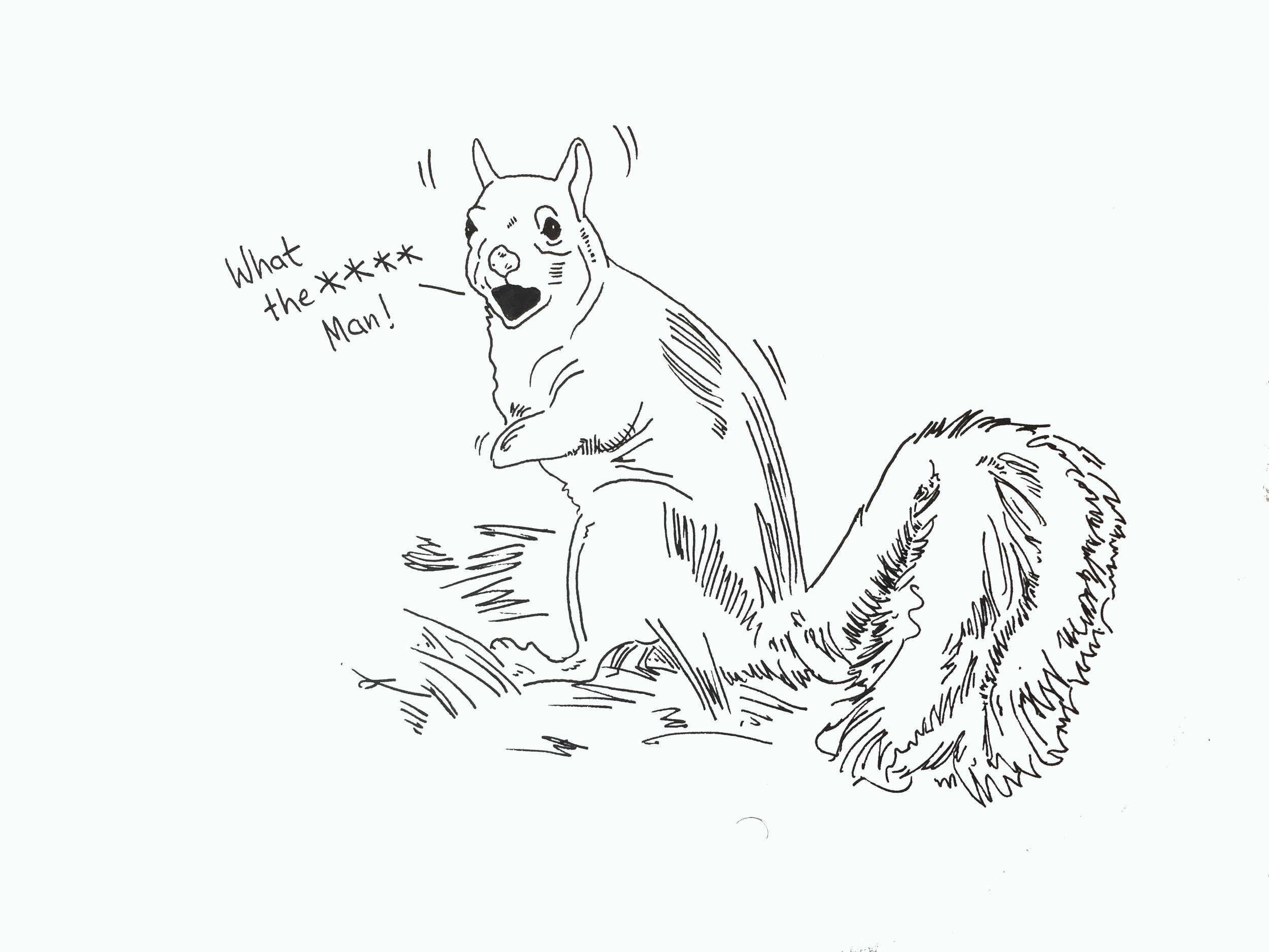
fig.1: #Inktober2019 “Husky”
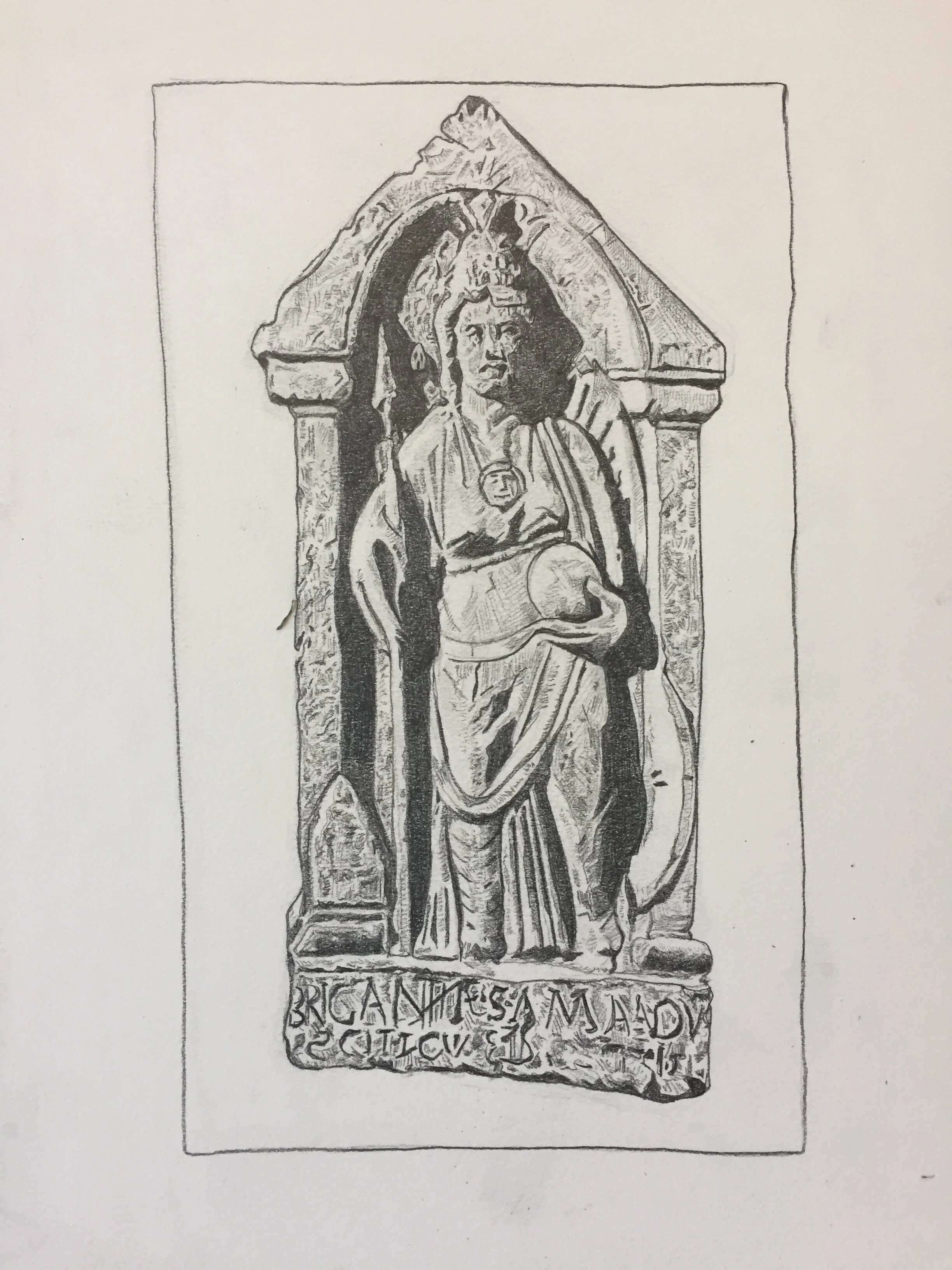
So far I’ve done a couple of pieces, but one prompt – “husky”, threw up this image [fig.1], the word spinning through random associations till coming to rest on the quality of a voice, which took me to Paul Robeson, whose amazing voice my father listens to for moments of solace as his dementia takes away more and more. In the image Paul is singing ‘Joe Hill’ to miners at Woolmet Colliery, and I wanted to use coloured inks to bring out the rise and fall of the song, and the different qualities of the voice. Dad filmed Robeson’s performance for an episode of Mining Review (you can read more about that here https://www.bfi.org.uk/news-opinion/news-bfi/interviews/paul-robeson-coal-mine), though I wonder how much now the tone, and deep feeling of the singing means more than the original memories that anchored his love for the songs.
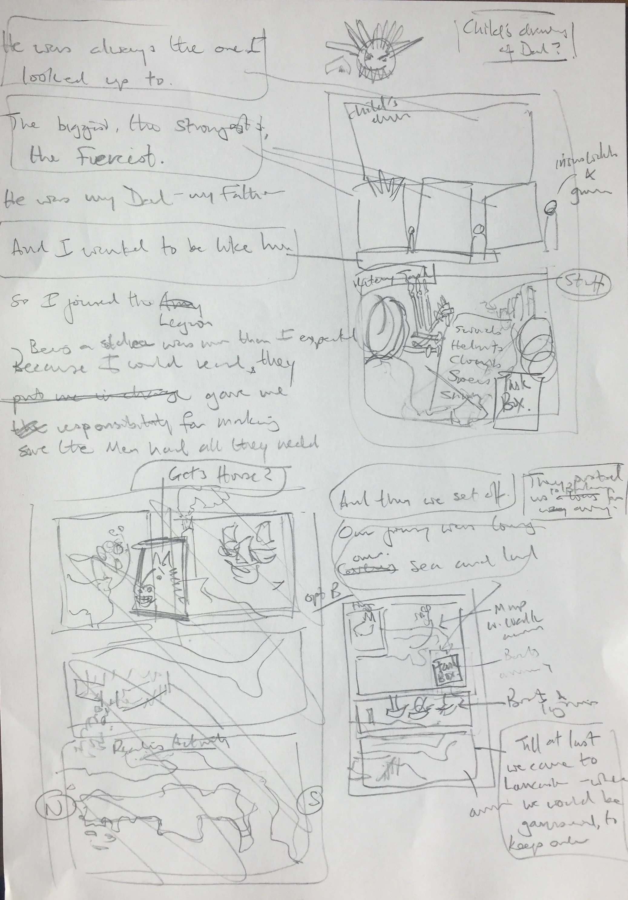
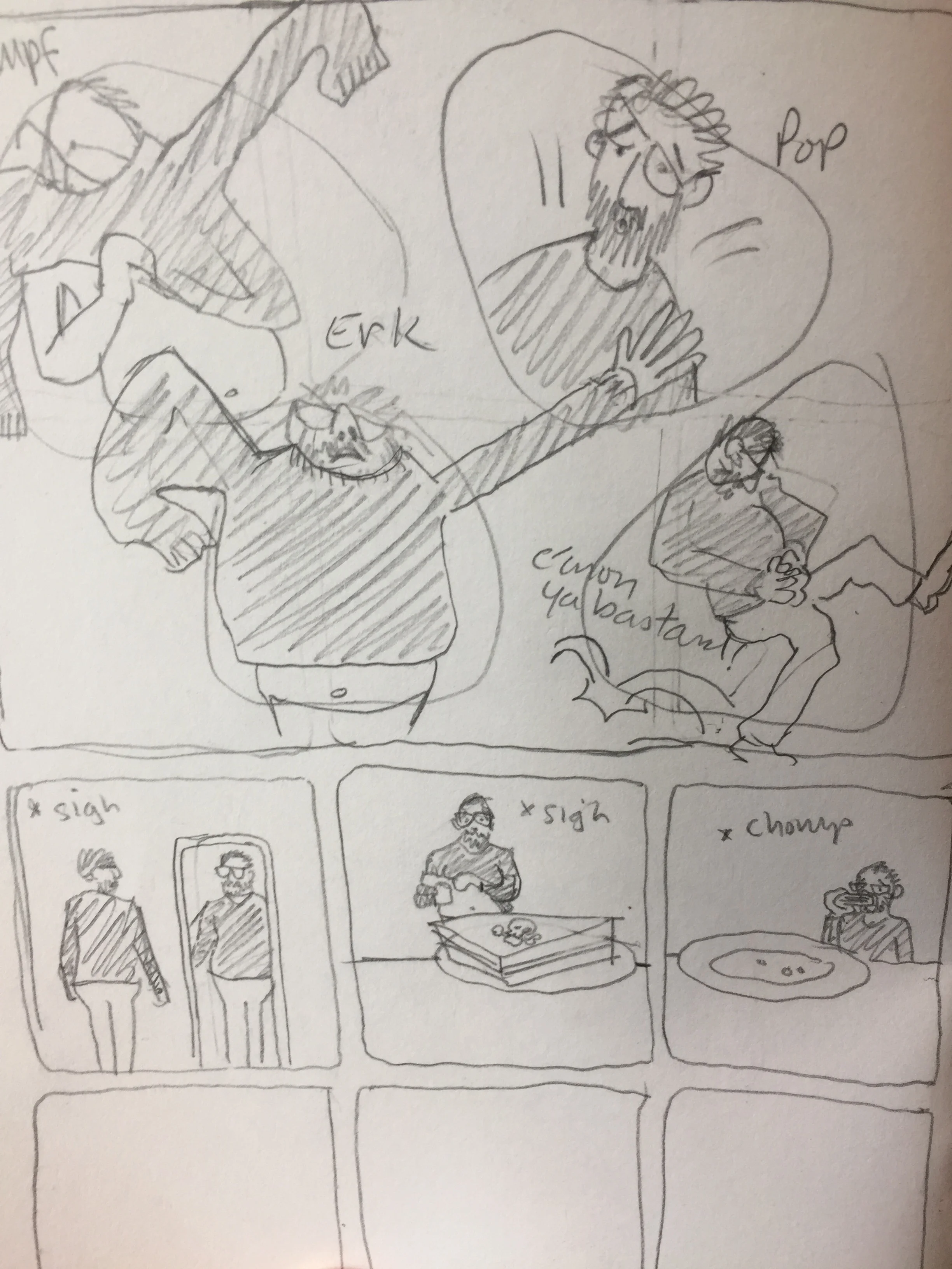
On that note, I’m giving the rest of the blog over to a graphic short story I drew last year about the moment we decided Dad would have to move into care… “The Decision”…

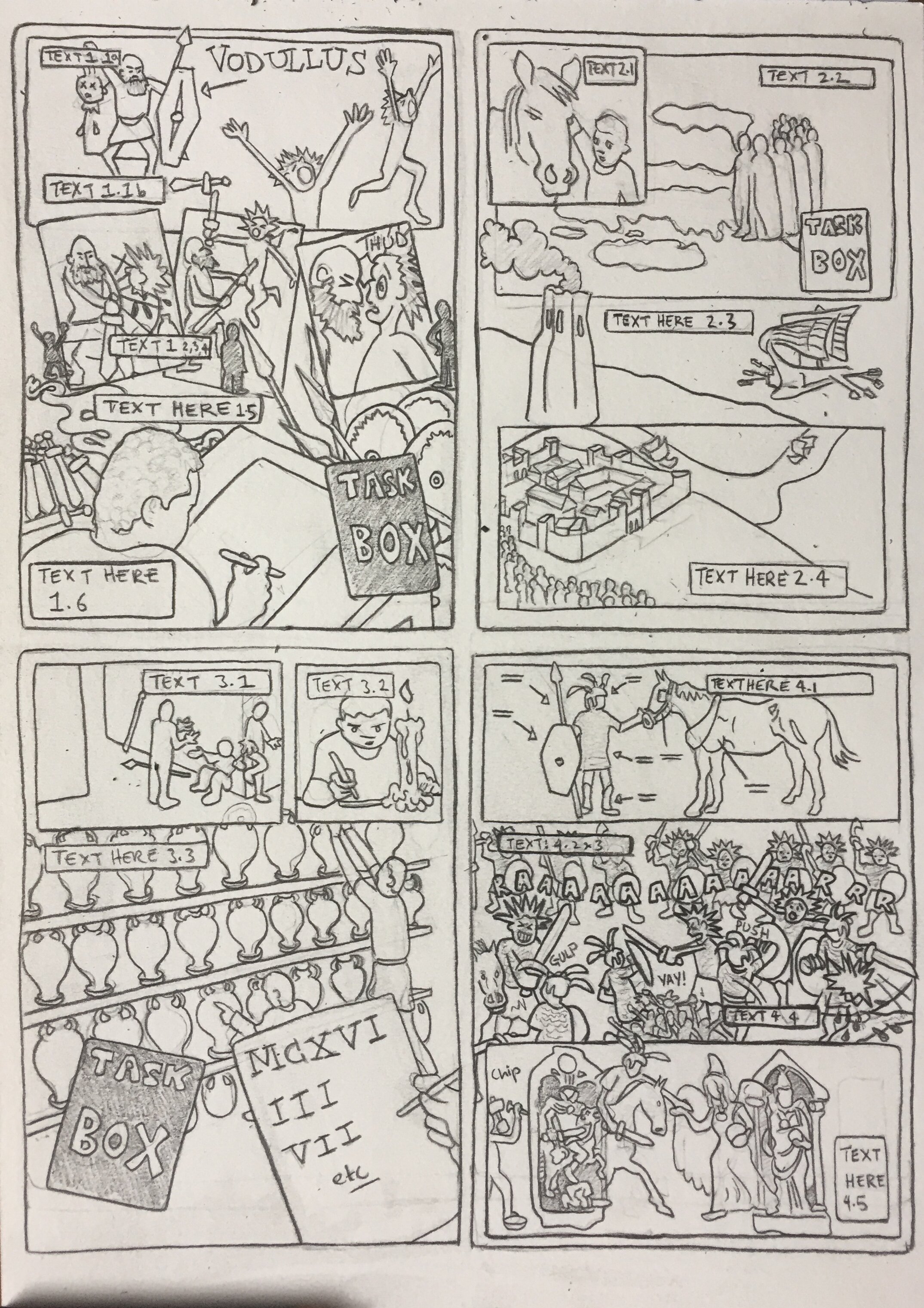
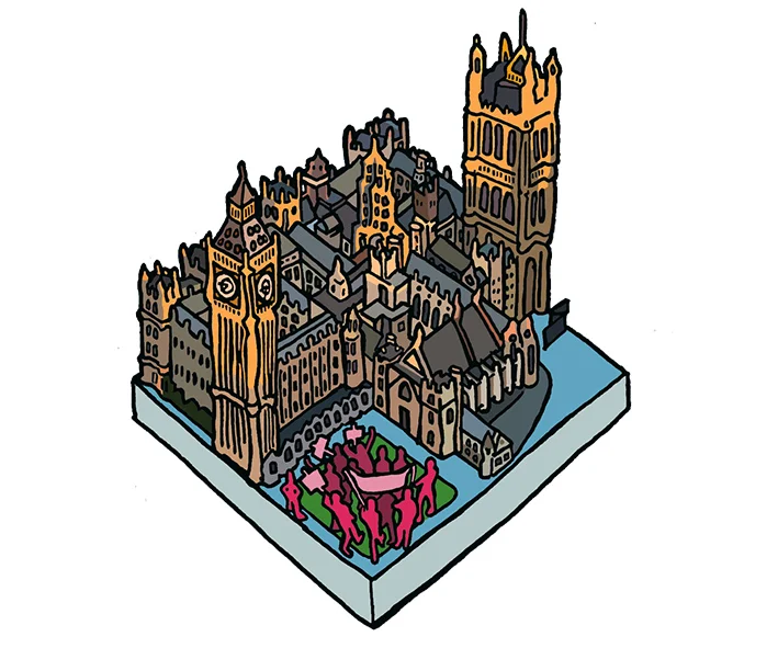
fig.2: The Decision pg.1
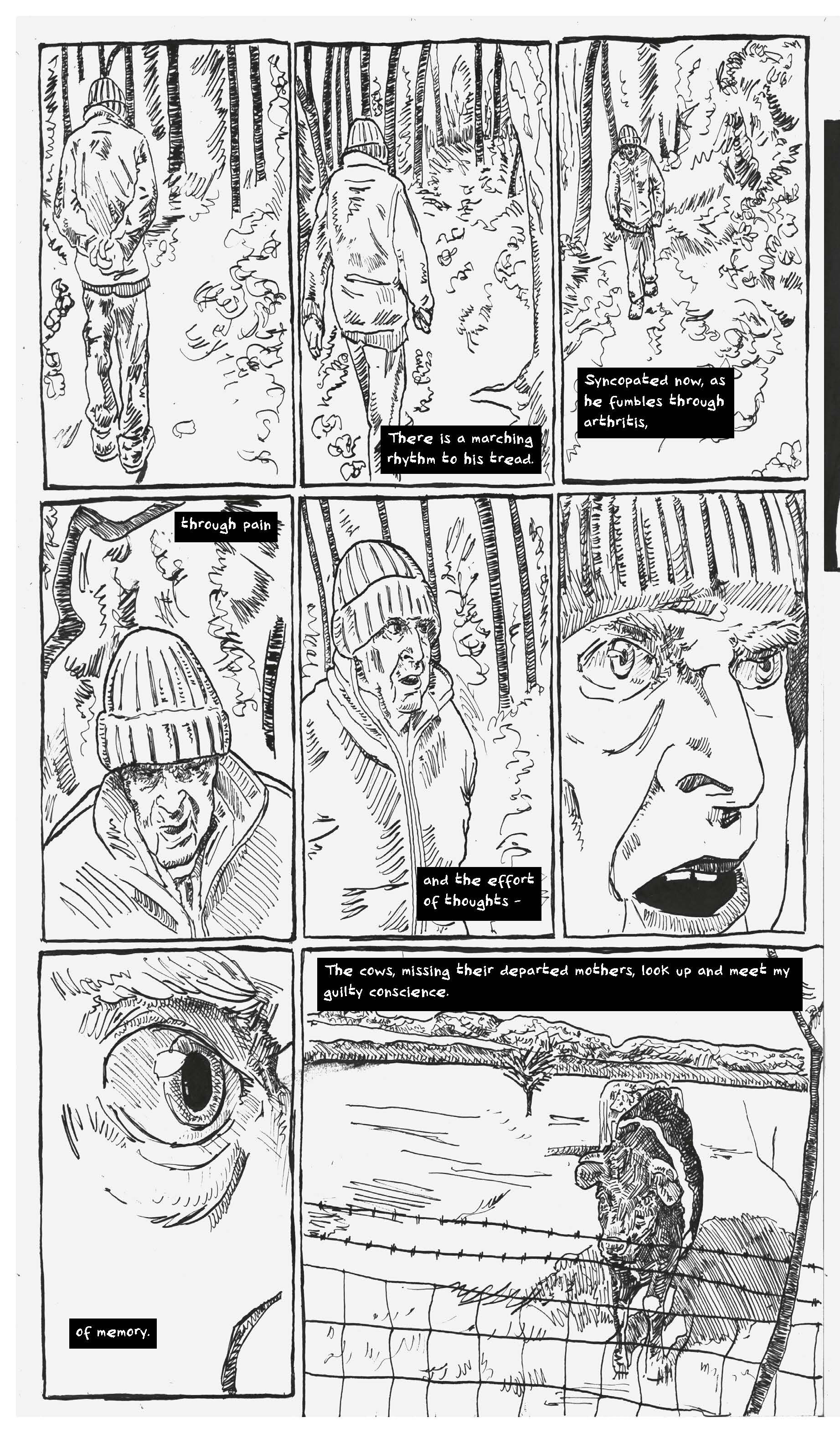
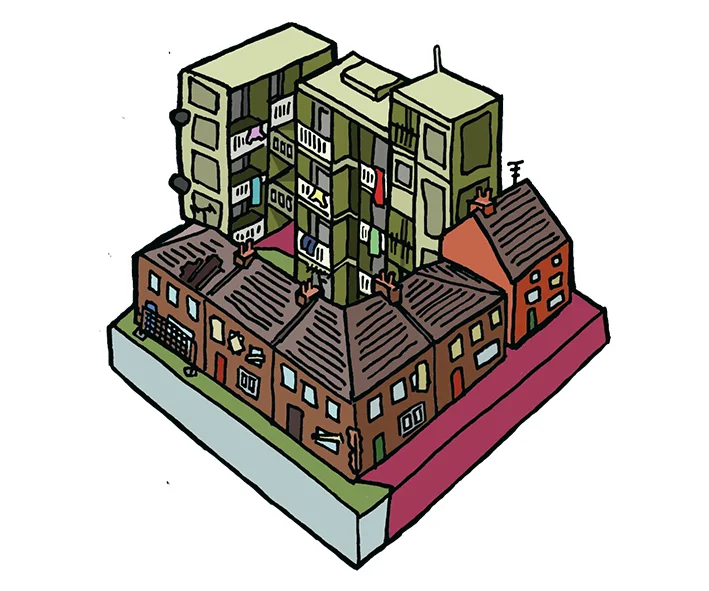
fig.3: The Decision pg.2

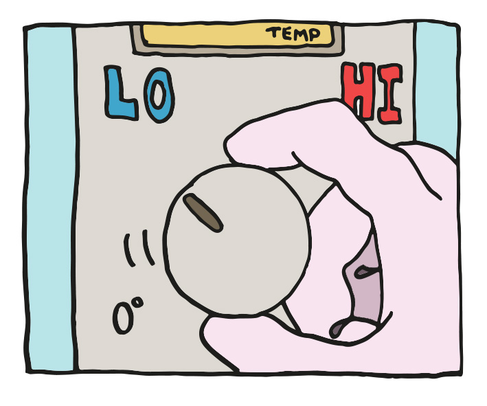
fig.4: The Decision pg.3
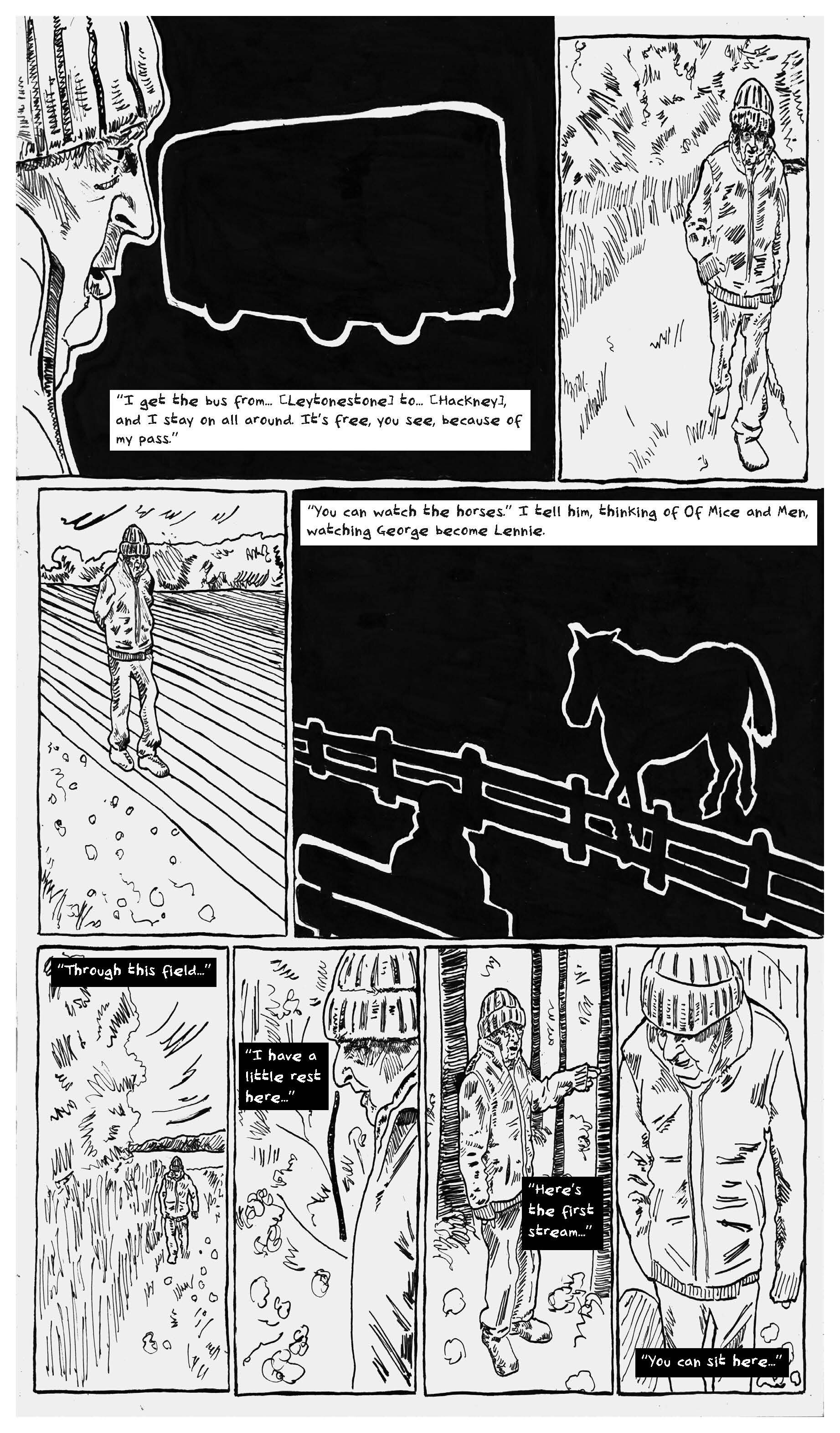
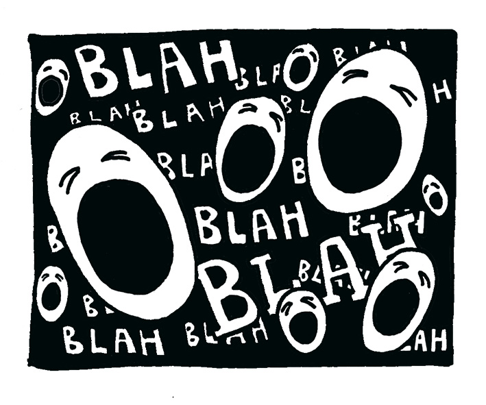
fig.5: The Decision pg.4