
Right, I’m back, and the coffee has brewed, so let’s go.
After a bit of a break, and some time with my Dad, this week I want to reflect on some work I produced for a Card game – Carbon City Zero: “A deck-building card game where players race to create the first zero carbon city”, produced by Dr Sam Illingworth and Dr Paul Wake at Manchester Metropolitan University and the charity 10:10 Climate Action.
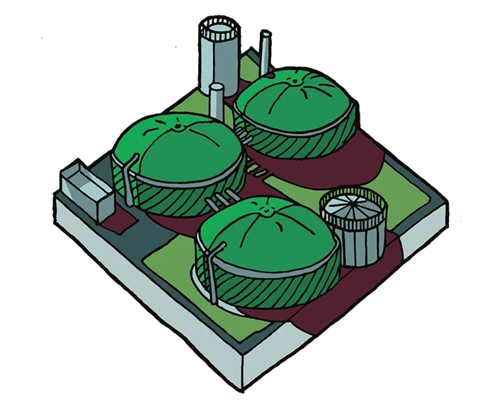
Fig.1: Biogas Plant
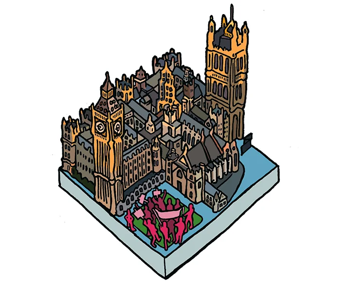
Fig.2: Lobby Ministers
My brief was to produce illustrations for the cards – with three distinct sets of cards. The creators wanted the sense of building a city – so liked the idea of isometric tiles that felt as if they could fit together. They also liked the hand-drawn feel of the line in my Newcastle: City Tales sequence. The cards had to have the feel of a recognisable world, but also – given the aim of getting the players to make their city carbon neutral, as if the world was a place where good choices could be made [fig.1]. They also had to be objects that people wanted to engage with.
Right-ho then.
I researched isometric images, and realised the maths was going to be fun – especially as the images I came across often had a futuristic and computer-generated feel. Amazing as some of these images were, I quickly realised that my approach needed to be different. My solution was to cut a template – so I could repeat the maths quickly (a little trick I’ve picked up working out maths for food with my type 1 ;) ), this enabled me to work to a ratio, and perspective consistently - except where I wanted to cheat.
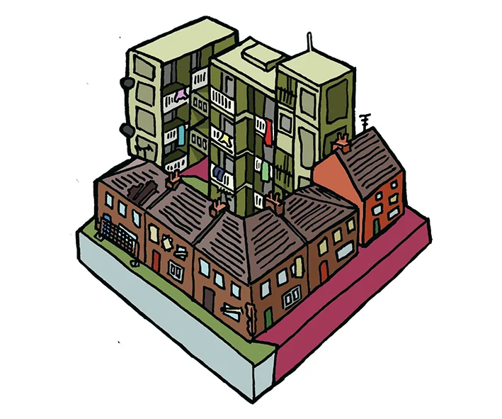
Fig.3: Poor Housing Stock
With the framework set up I could get into the nitty-gritty. I soon began to enjoy realising the detail of the urban landscape [fig.2]. The drawings moved from the futuristic to the decaying, from technology to the human figure, from the high-rise to the everyday – in short the nuance and complexity of a modern city.
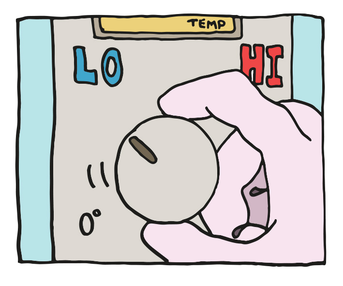
Fig.4: Behavioural Change
My initial pencil drawings were tonal – playing with depth and the perspective of the isometric base. Windows, doors, nooks and crannies, these all became part of the texture of the drawings. To keep the hand-drawn feel I resisted the temptation to trace the line in Illustrator – instead inking the pencils, scanning in the inks, and cleaning up any pixel distortion in Photoshop (I know this can be done quicker – and when I get an i-Pad we’ll talk *sigh). I simplified the drawings as I moved from pencil to inking the outlines but decided when I chose to add colour digitally that I wanted to reflect some of the tonal quality, so used tone as well as light and shadow to build my colouring [fig.3].
Fig.5: Poor Communication
The other card sets had to have different qualities – some infographic, some bleaker, but they also had to feel a part of the game. These cards are more graphic [fig.4], and more cartoon [fig.5] – both deviations I enjoyed, playing with symbolic and satirical impulses, and the thought behind representing data and ideas. The link between the sets is in the line – or the tone of voice that speaks to the player, that starts the dialogue.
With 39 images, this was a large project, but one that was absorbing, challenging, rewarding, a project I’m proud to be a part of – Oh, and I quite like my drawings too ;)