It’s been hectic so far this week, so a very quick, and late post this week, and not much commentary I’m afraid, but i didn’t want to miss a post… so *coughs*, here it is.

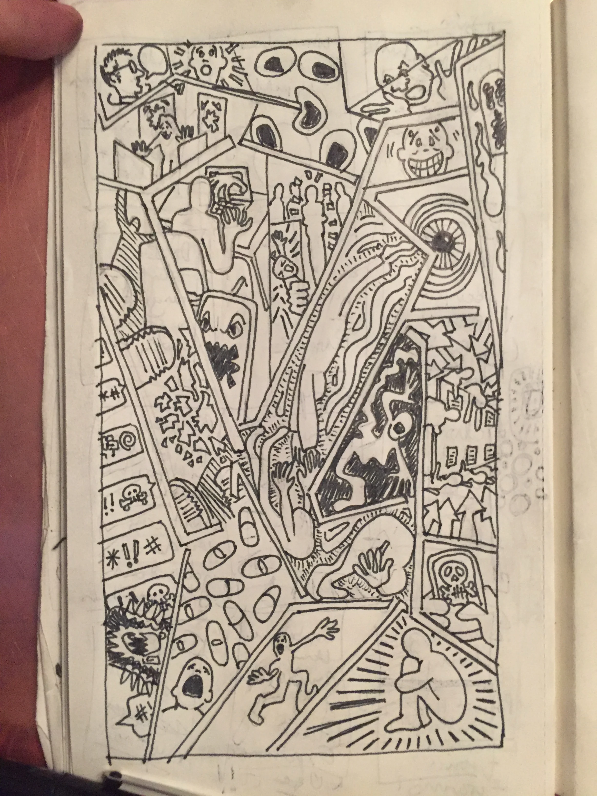
fig.1 “Mental Health/Escher” WIP
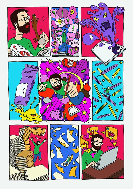
Grabbing some moments for my work has seen me messing around with the disorientation of 3D to explore my mental health/Escher sequence that I’ve been developing [fig.1]. This needs some clean up, and refinement - the balance isn’t right yet, but it’s now got me thinking that I might produce this as a series of print versions - and that 3D has definite possibilities. My normal process involves working quickly on instinct - partly to bypass overthinking, but, with this image, there’s scope for exploration and investigation, which I want to enjoy.
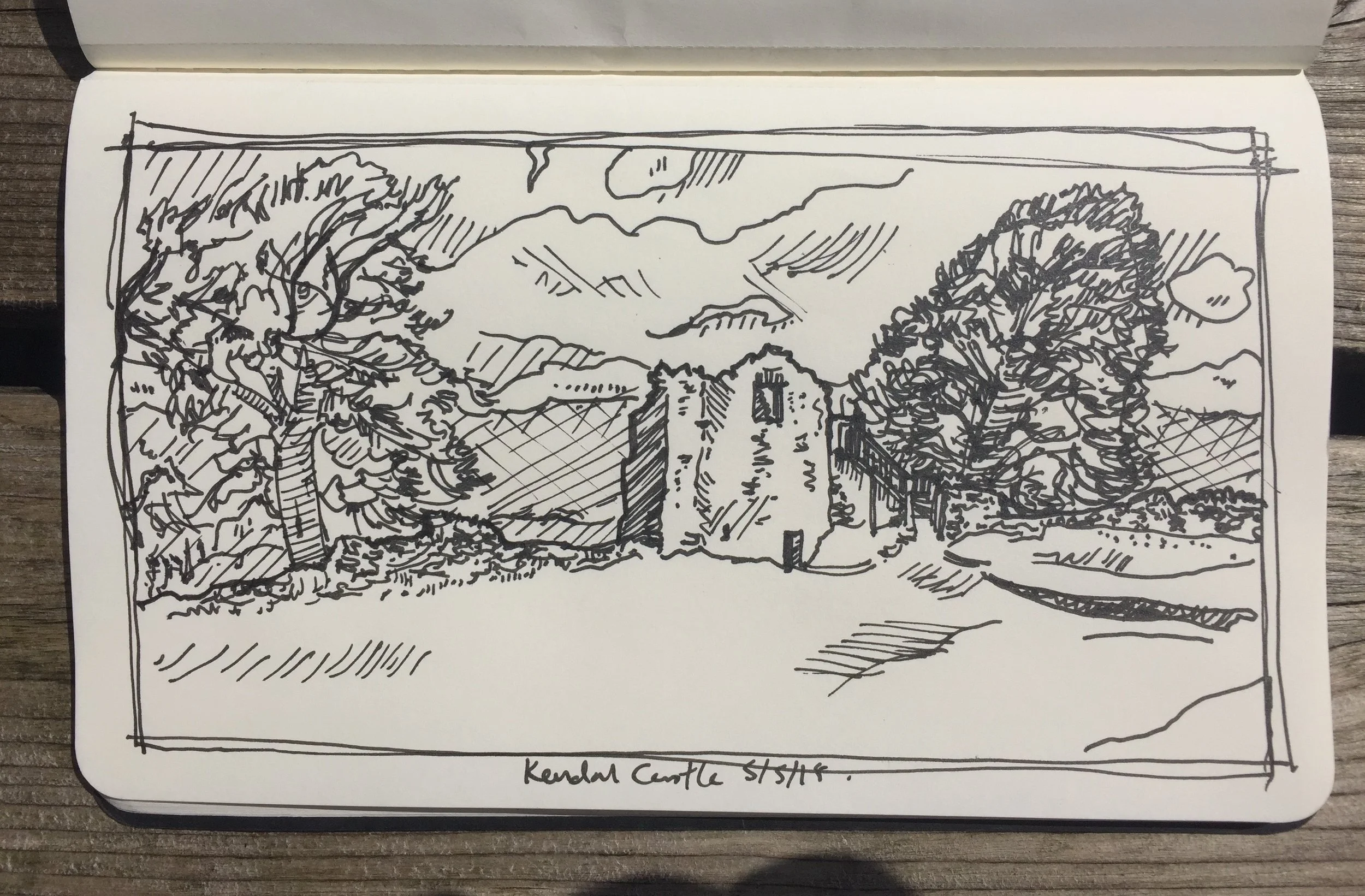
Otherwise I had a chance to visit my Dad in his care home. Because of his dementia sketching has become a part of our communication with each other, filling in the blanks in memory and conversation [fig.2]. He enjoys watching me sketch as much as the finished product. This time we were able to spend some time watching adult Blue Tits bringing food to their young. I didn’t catch the birds, but the trees and the boxes led to a sprawling and expressive sketch that seems to exist between my more controlled drawings and my scribbly sketches from life…

The posts for the next few weeks might also be image based, but I suspect it will all lead to reflection in time ;)… Right, that’s my snap-shot of my thought/work process this week - now, have to dash.


![fig.1: Germs: Wash Your Hands (St Giles Medical) [Wip]](https://images.squarespace-cdn.com/content/v1/521735b4e4b0563499dc8f68/1556524270592-KSO7LDOVBS9F0ZUHY8VE/hands+n+germs+web.jpg)
![fig.2: Thumbnails and Drawings. [Wip]](https://images.squarespace-cdn.com/content/v1/521735b4e4b0563499dc8f68/1556524365445-UP0YJ27KT1FNDQHPP27O/IMG_7908.JPG)
![fig.4: “Factory”: Carbon City Zero (Manchester Metropolitan University) [Wip]](https://images.squarespace-cdn.com/content/v1/521735b4e4b0563499dc8f68/1556525078731-F86Q95CYD7LUAK5774L0/large+factory.jpg)
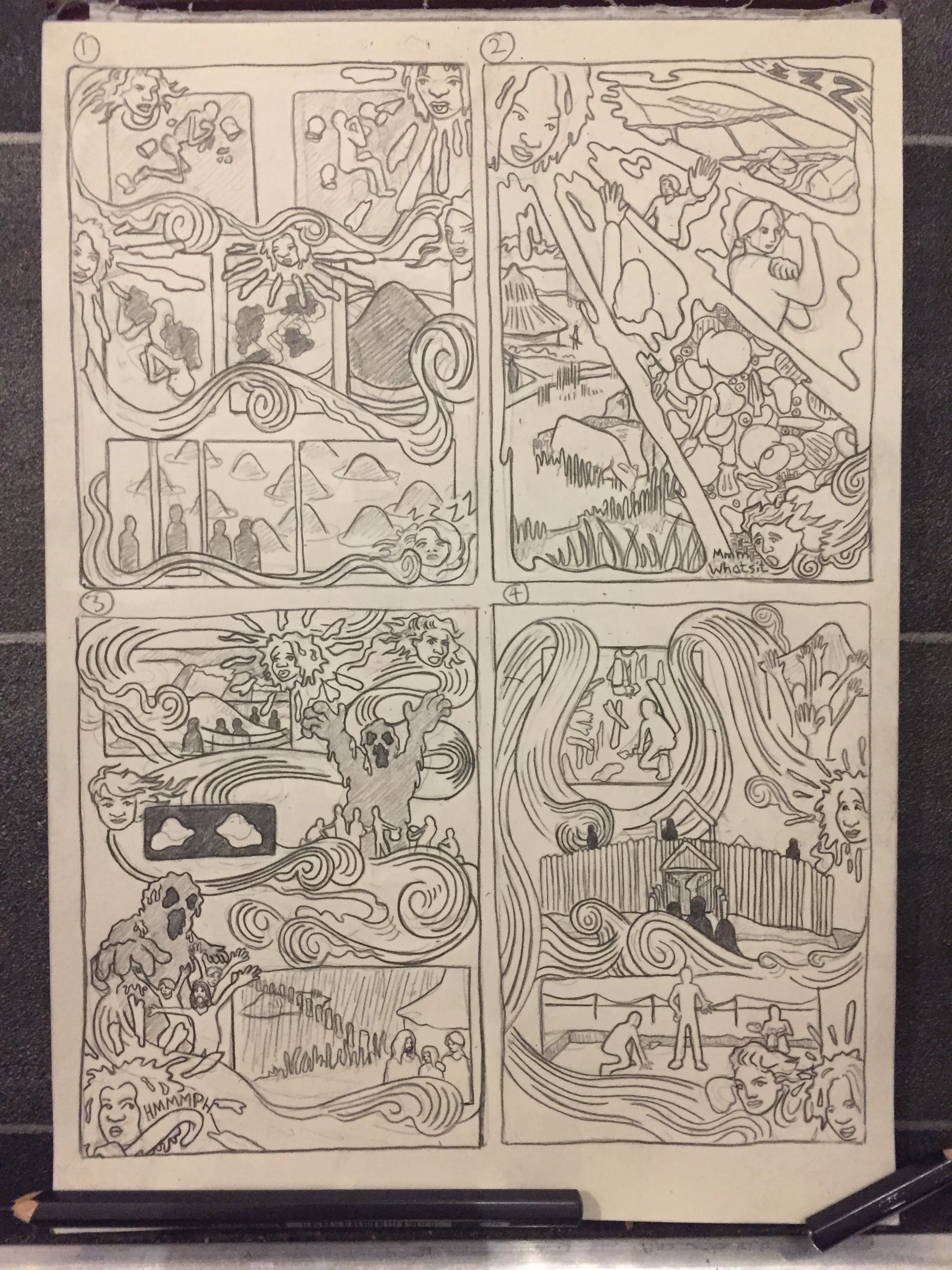
![fig.3: Pre-History to Primary Schools: Iron Age page 3. (Manchester University). [Wip]](https://images.squarespace-cdn.com/content/v1/521735b4e4b0563499dc8f68/1556524560105-QPAO55WQLHLVDWFPAOX6/the+iron+age+comic+pullout_Page_3+copy.jpg)