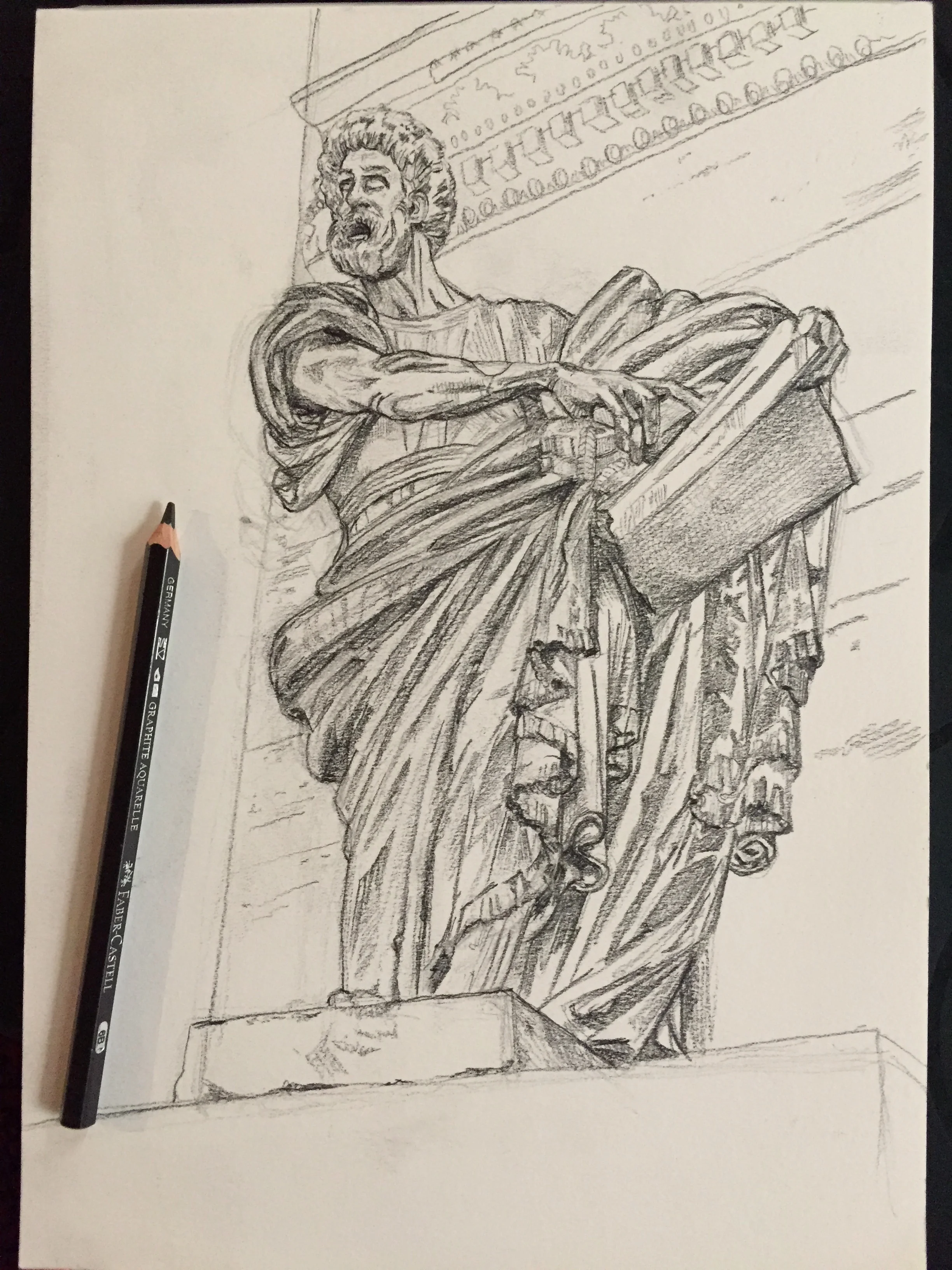
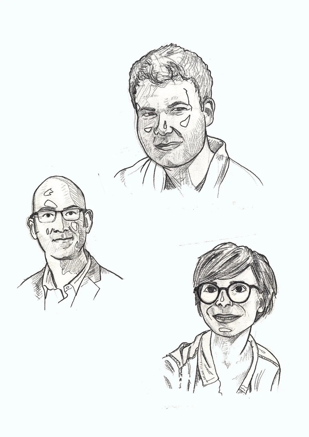
fig.2: Brigantia statue
Starting a new project is always a massive comma. You’re ready to go, and excited, and then stumped. I mean – I’ve got an idea, a feeling of what I want to do, but actually starting, well that’s another matter. And this is where games, experiments, trying something completely different – all these things, come in.

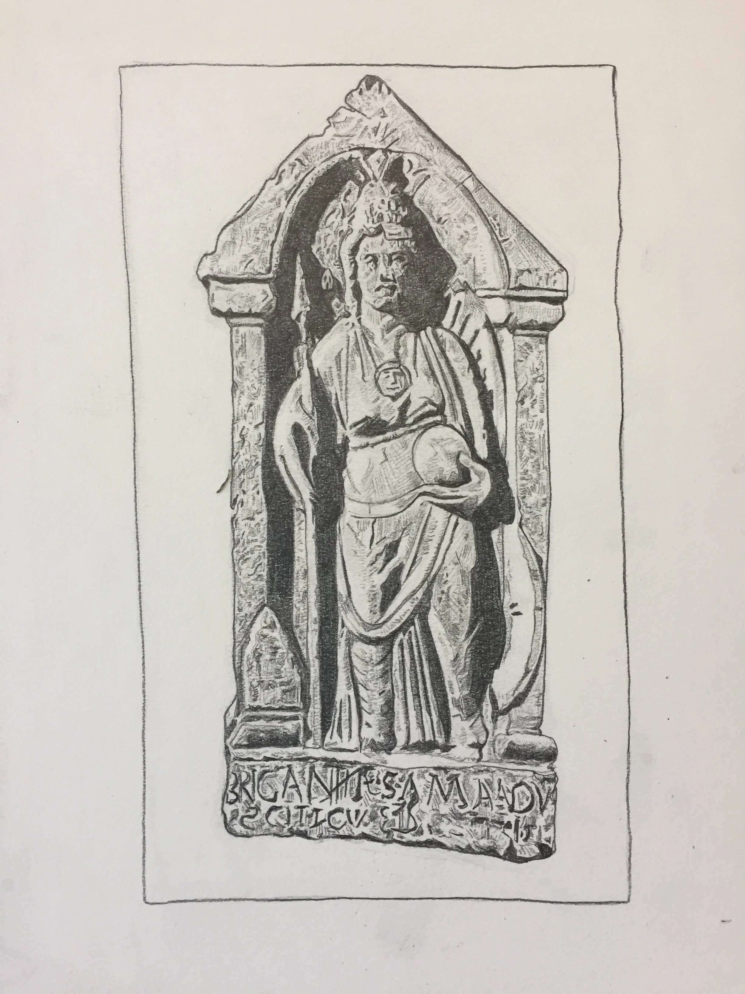
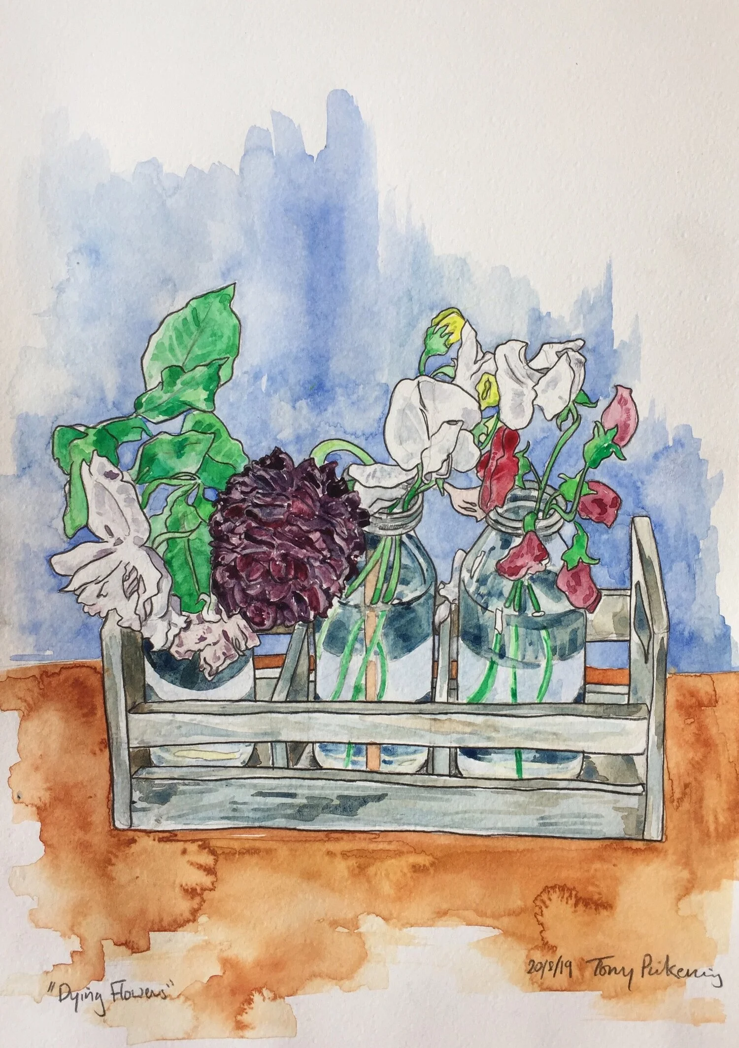
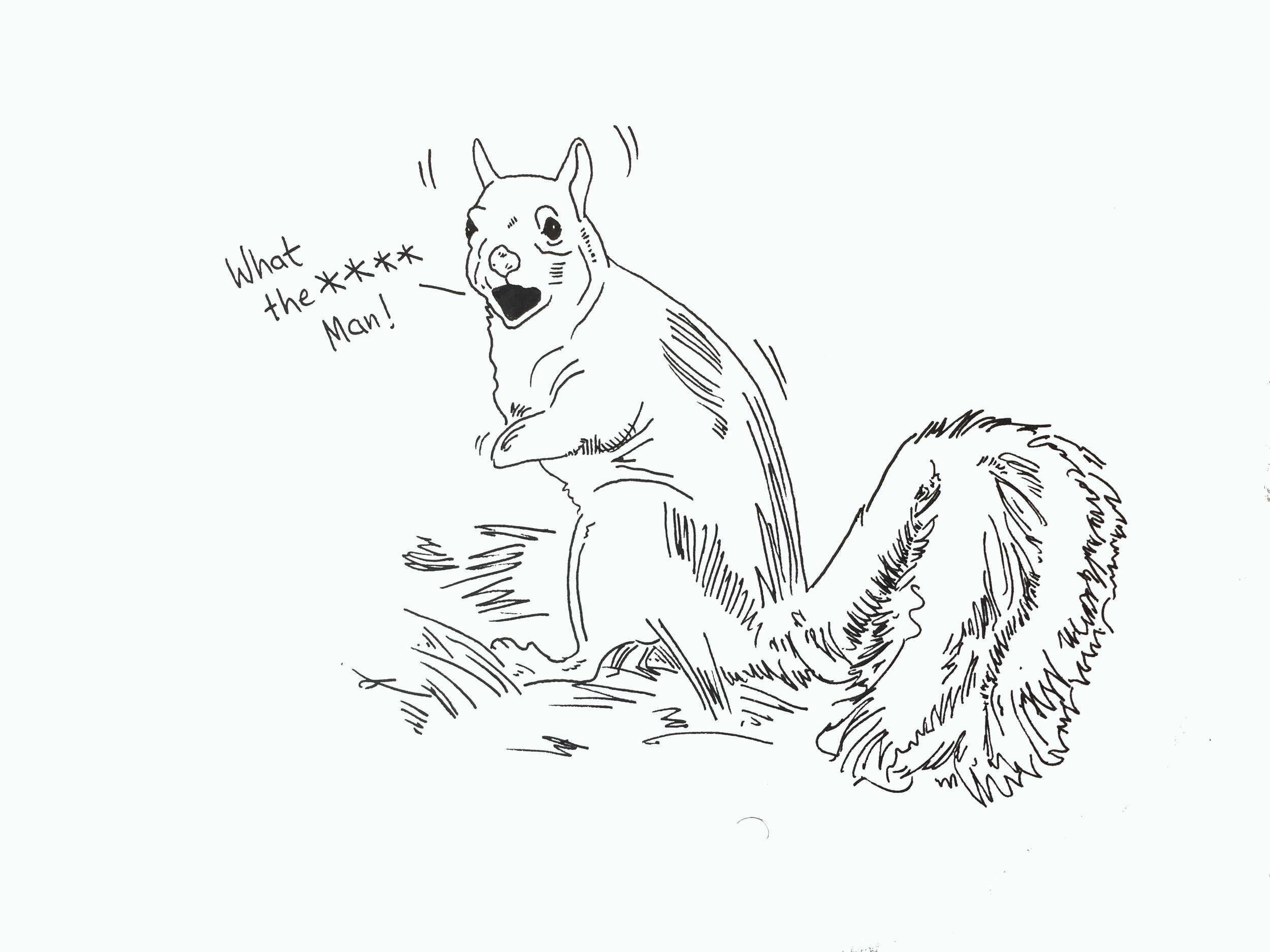
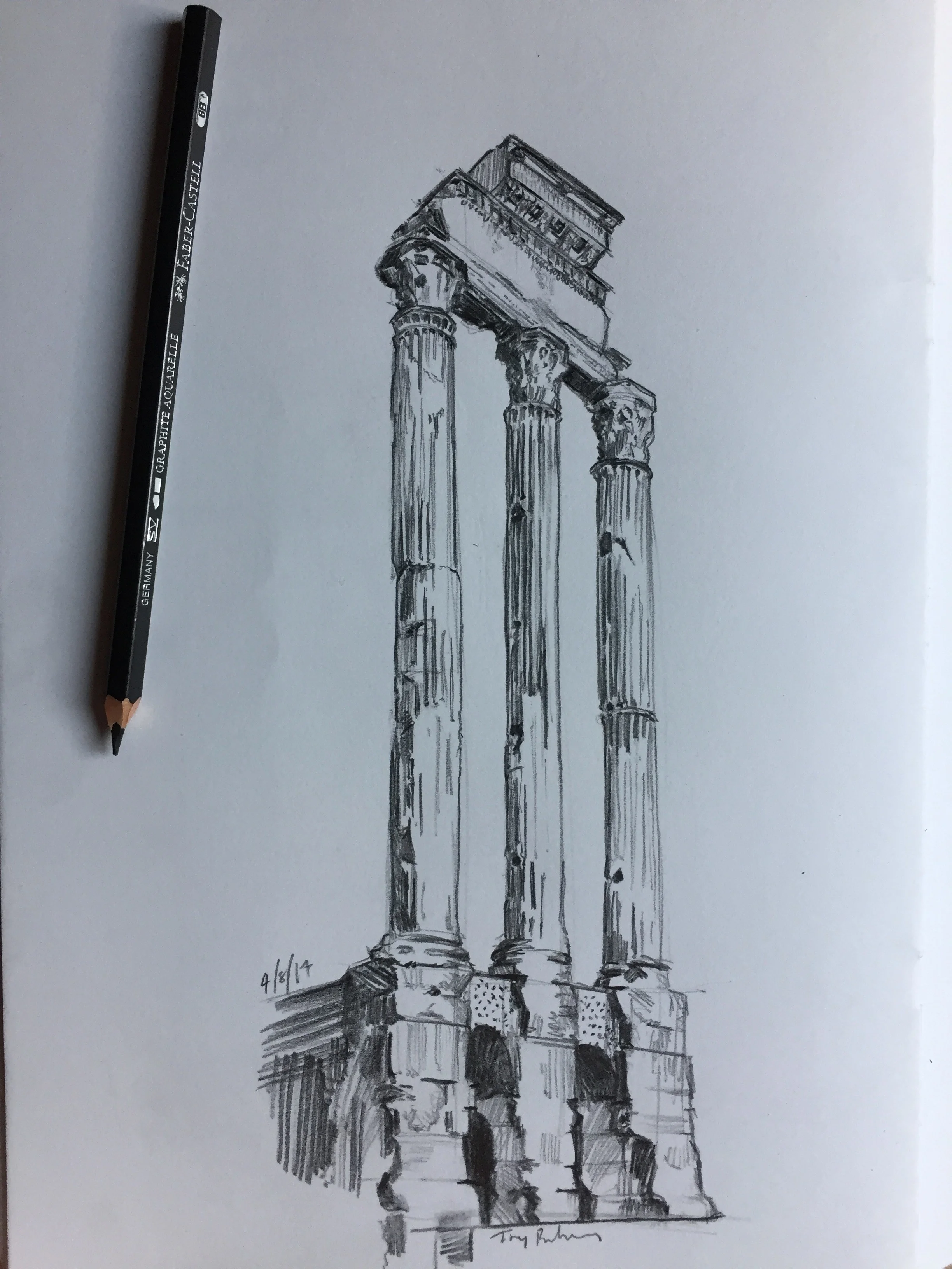
fig.2: Insus tombstone
My latest project is taking a scenario and creating a comic about The Romans. I’ve had the first meeting, talked over the scenario, the key bits of research that might be of use, and asked a load of stupid questions (I find asking as many of those is really useful to get a sense of what the brief is); but sitting down to start – nothing, flatline.
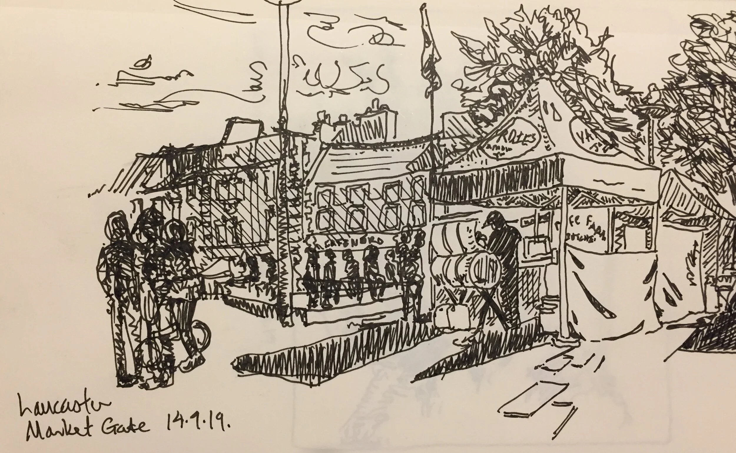
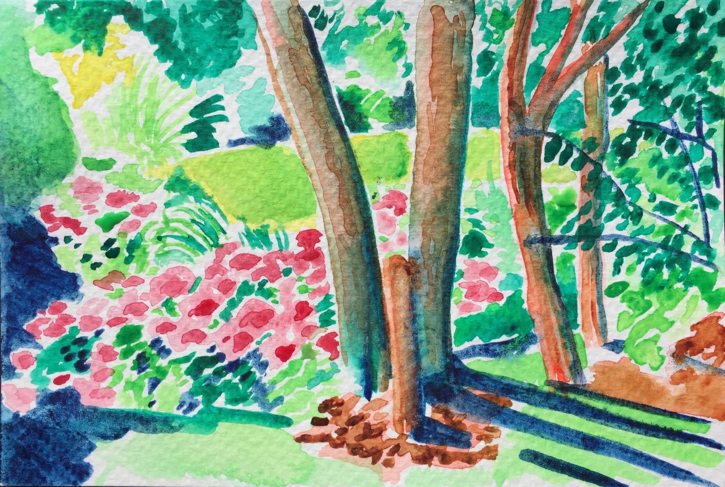
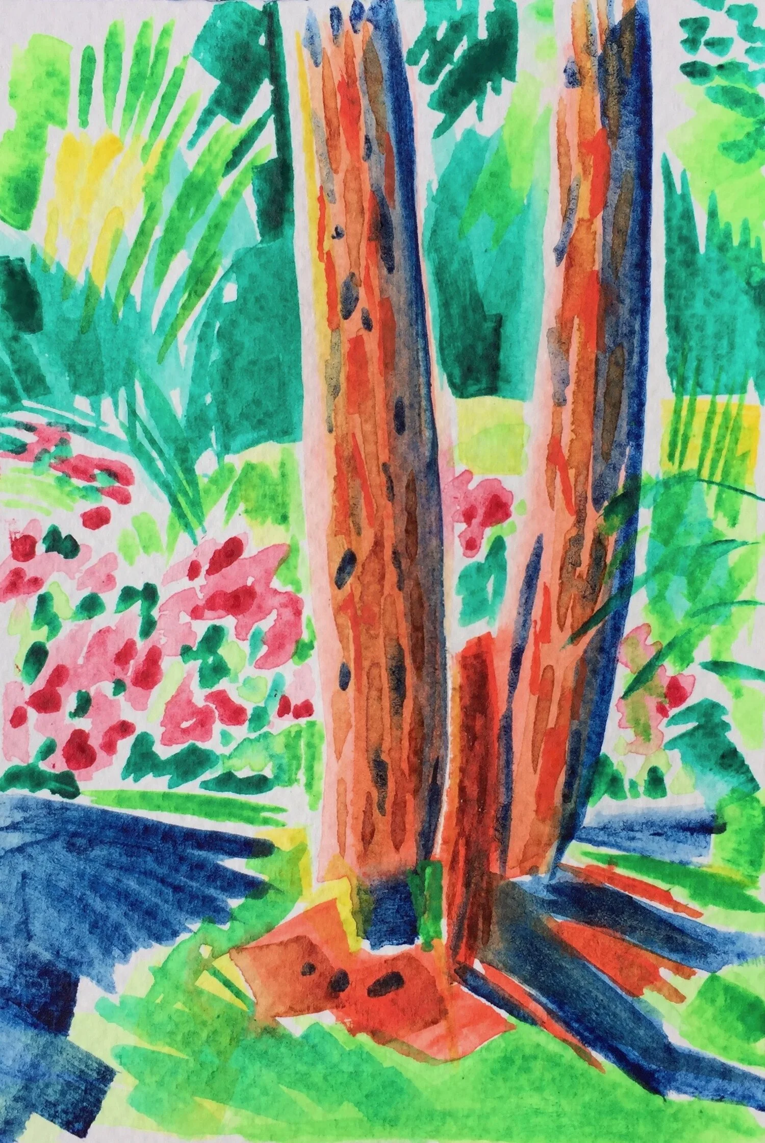
fig.3: Lancaster Market Square
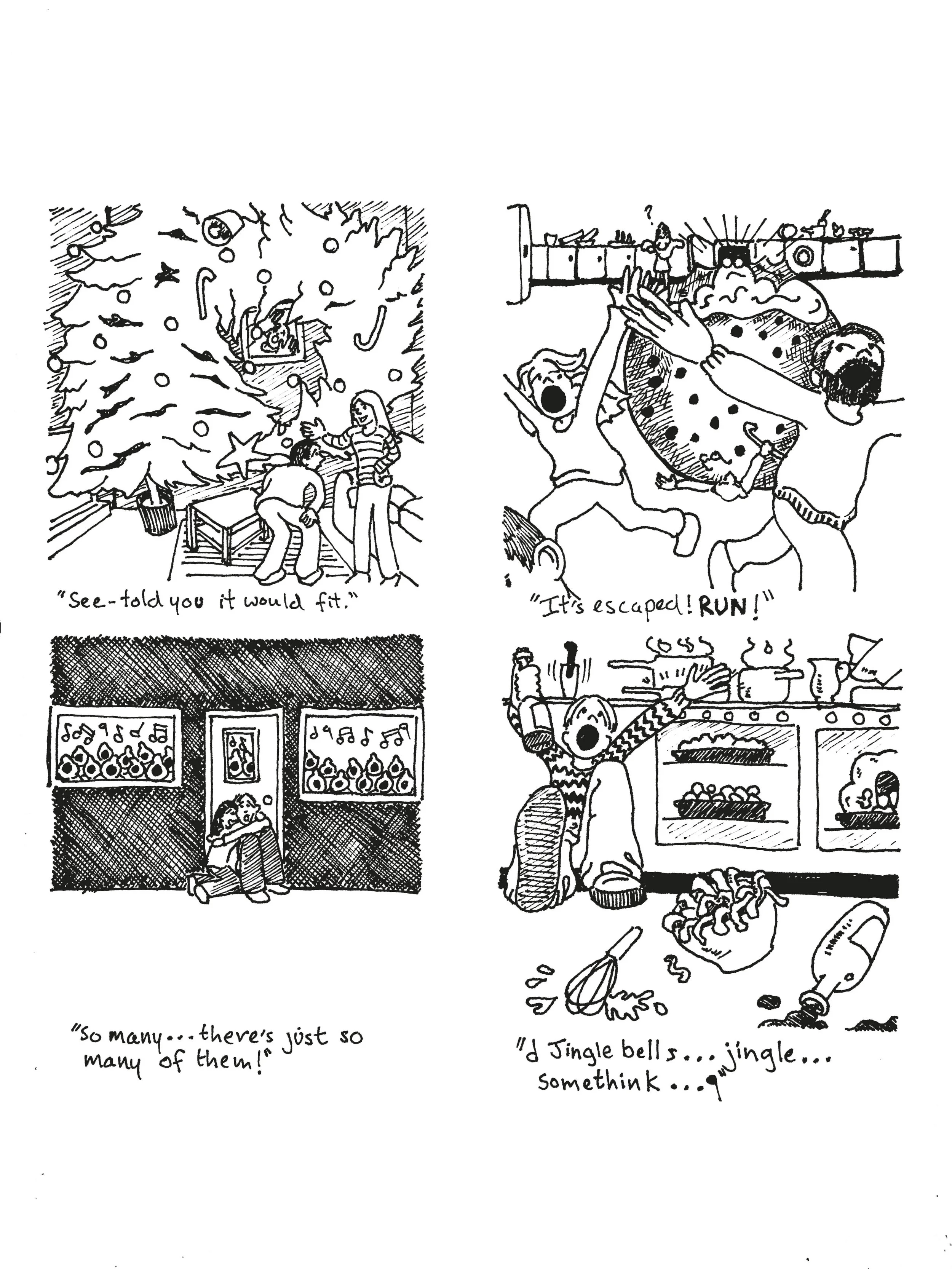
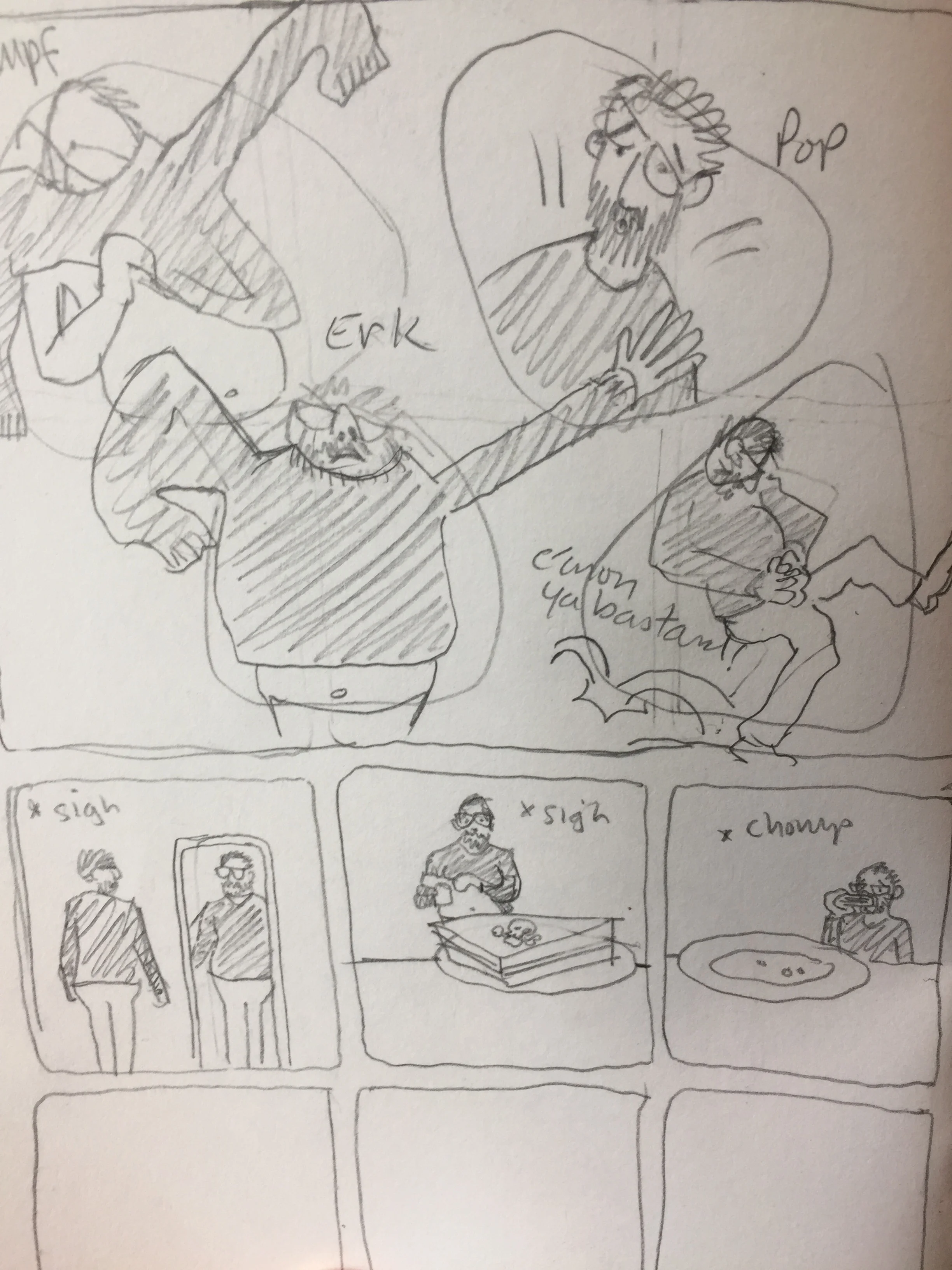
At this point I generally get frustrated with myself. I stare, I think, I make coffee – and another; I pick up my pencil – then put it down and check some emails – catching myself I stop, have more coffee, then go for a walk. I mean I know I can write a script and plot a sequence of panels (what I call proto-thumbnails – loose compositional sketches to work out how the narrative will progress together with the images [fig.4]), but I can’t get past the white page that seems to be grinning at me. The danger is that the frustration can lead to giving up, or worse avoiding the issue – burying the project under a load of to-do lists sort-of-thing.
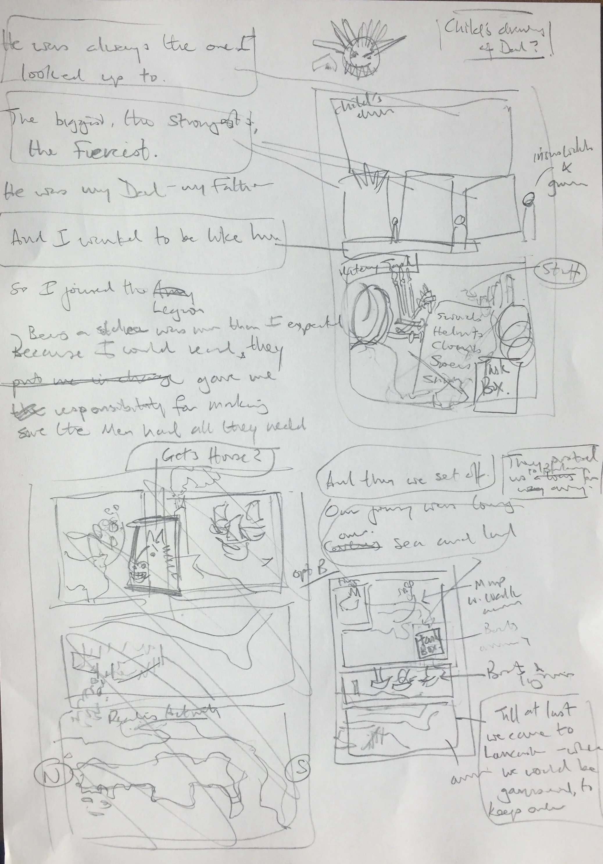
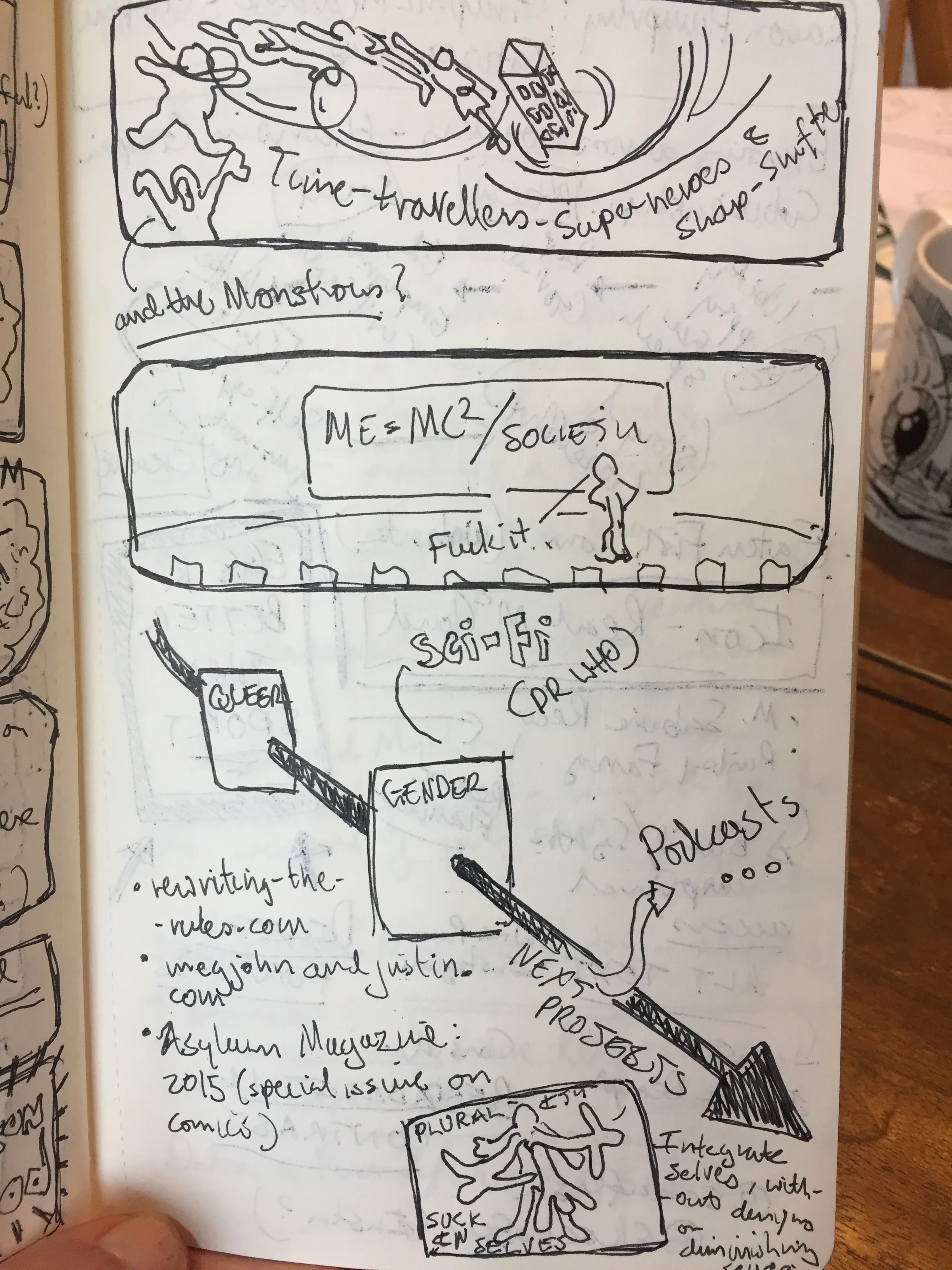
fig.4 Proto-thumbnails
My way in, is often through drawing – quite detailed drawing. In this case the recreation of research images, which force me to look fully, to arrange my thoughts with discipline, and to imbibe a sense of form and shape that will inform the format of the comic itself [fig.1].
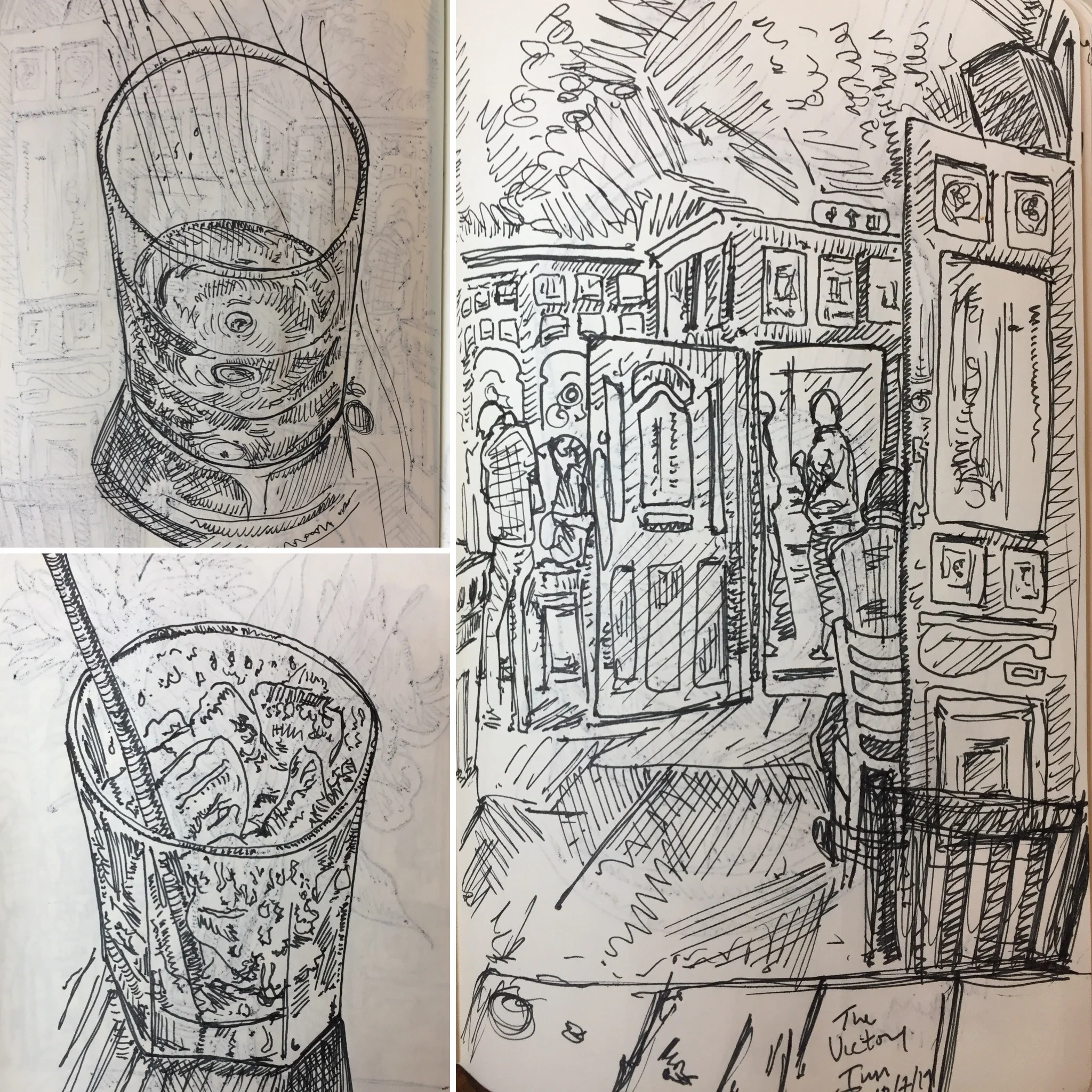
Add to that a physical visit – researching more artefacts, walking the space to get a sense of the landscape and place, aided and abetted by the endorphins of movement, and the dissonance of the different. All of which provokes more drawing [fig.2 & 3] - some is specific, but some is about letting my imagination explore the space around the topic. Now my notes suddenly seem to make sense; and the white page begins to reveal a pathway into plot and story.
So, before I know it, the first draft is completed – alongside a load of new questions that will be answered as I start to draw the thumbnails proper.


![fig.1: The Wasteland [pencil on paper]](https://images.squarespace-cdn.com/content/v1/521735b4e4b0563499dc8f68/1561961312490-HZMSBDJ1ZRL7Z1MNWFL9/scrapyard+contrast+copy.jpg)
![fig.2: YHA Boggle Hole [ink on paper]](https://images.squarespace-cdn.com/content/v1/521735b4e4b0563499dc8f68/1561961499796-Q0XGDSWNBB8YI212YDGR/yha+boggle+hole.jpg)
![fig.4: Kendal Castle [pen on paper]](https://images.squarespace-cdn.com/content/v1/521735b4e4b0563499dc8f68/1561961478396-TH7AGO96IQQZ7N5B67TO/IMG_6183.jpeg)
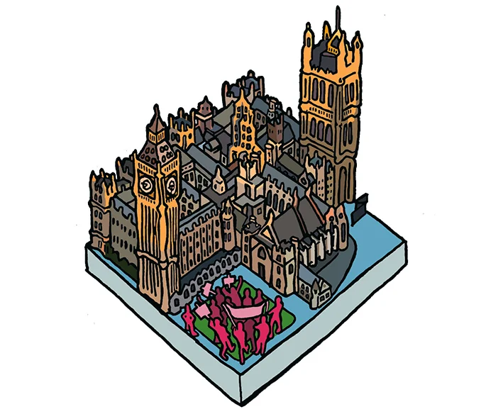
![fig.3: Shaftesbury Theatre [pen on paper]](https://images.squarespace-cdn.com/content/v1/521735b4e4b0563499dc8f68/1561961368993-CTRKHC66HL19RTBF8R2Z/IMG_6160.jpeg)
![fig.5: Sixty-Sixty Sounds [blue pencil on paper]](https://images.squarespace-cdn.com/content/v1/521735b4e4b0563499dc8f68/1561961440508-6OBCEOUS1CCXAT2S6Q05/IMG_5748.JPG)
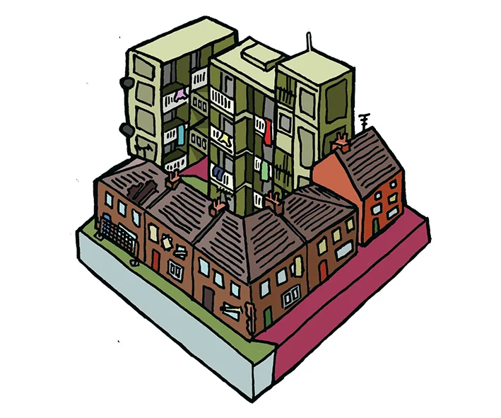
![fig.6: Spring Cottage [pen on paper]](https://images.squarespace-cdn.com/content/v1/521735b4e4b0563499dc8f68/1561964129776-AGUIBC1VS82H5P06VMN8/IMG_8141.jpg)